The Concept Behind Saytal Sakht (Construction)’s Visual Identity
Saytal Construction is a reputable brand and one the pioneer contractors of bulding facades in Iran. This brand has done a lot of projects in all across Iran. The visual identity design of Saytal Construction brand has been implemented in the form of a proposed design and at the request of this collection.
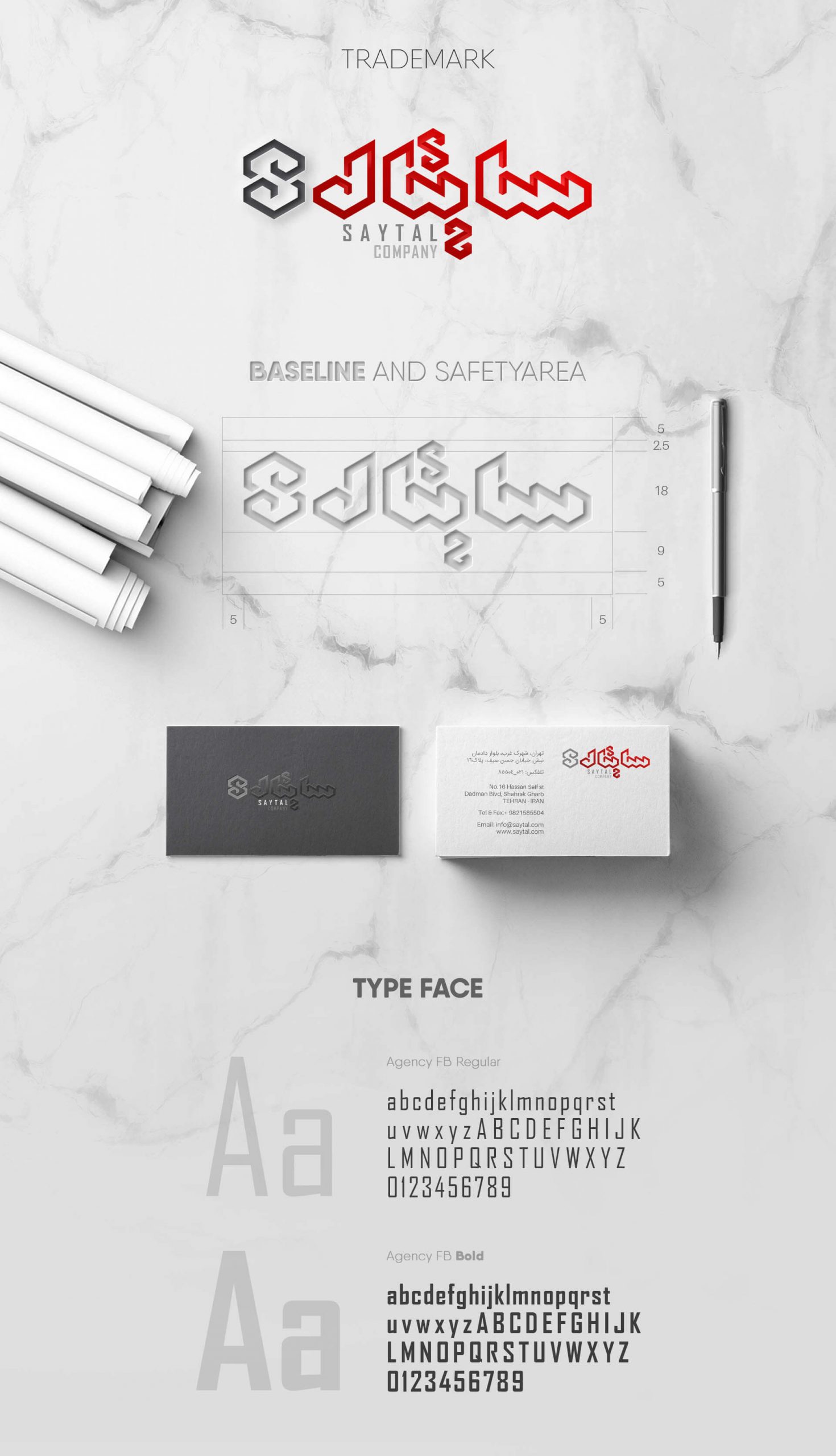
The visual identity design for this brand has been conceptualized and implemented in the field of engineering information and in accordance of its field of activity. In the concept section, geometric and angular forms are used so that it can have precise and direct references to the character of the Saytal Construction brand.
The Geometric Super Unit
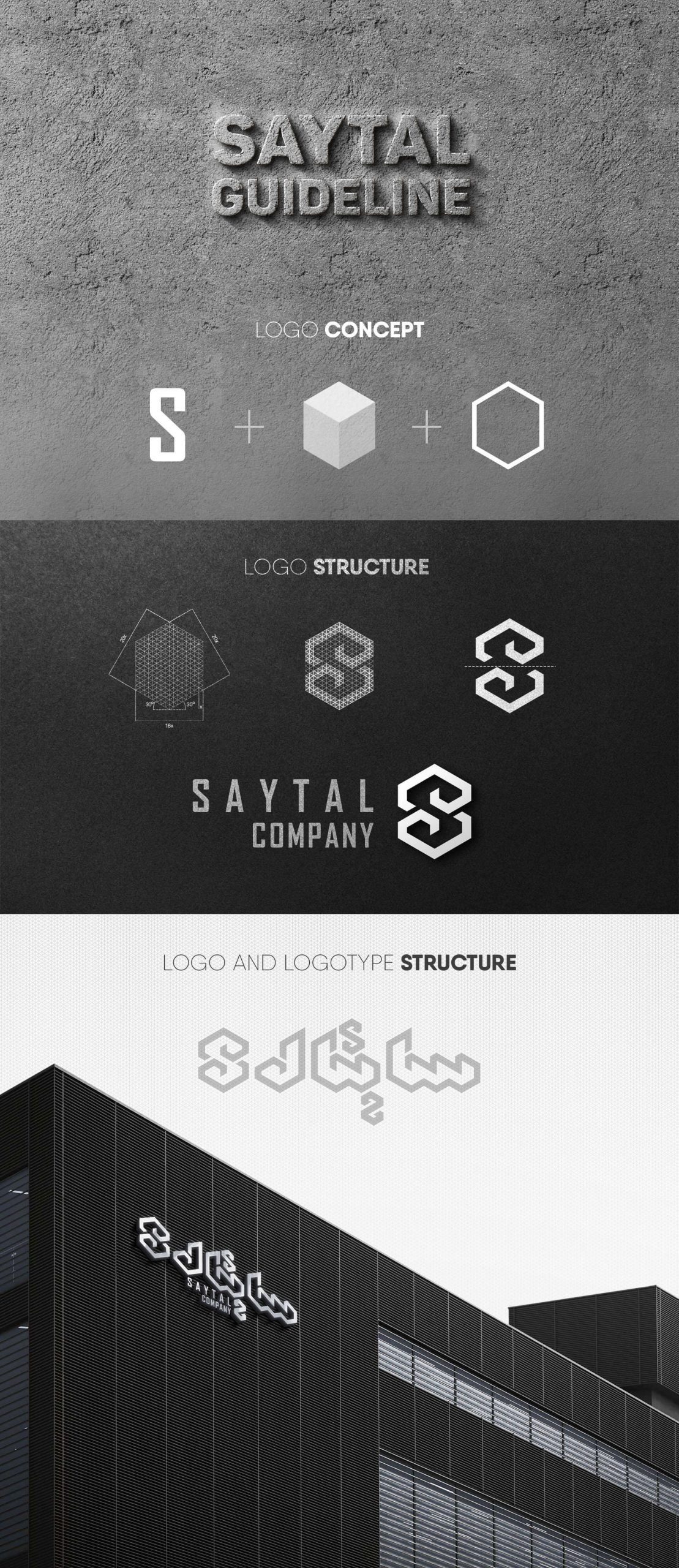
These geometric elements are extracted from the perimeter lines of a cube in perspective. The reason for choosing the cube is to refer to the construction industry (the brand’s field of activity).
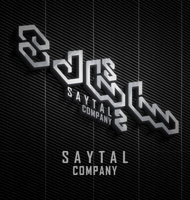
After analyzing the perimeter lines of the cube, a hexagon was obtained and this geometric shape was used to design the logo. The logo of the brand is made of two symmetrical forms that are placed on top of each other and with a symmetrical rotation it forms the letter S, which is the beginning of the words Saytal and Sakht.
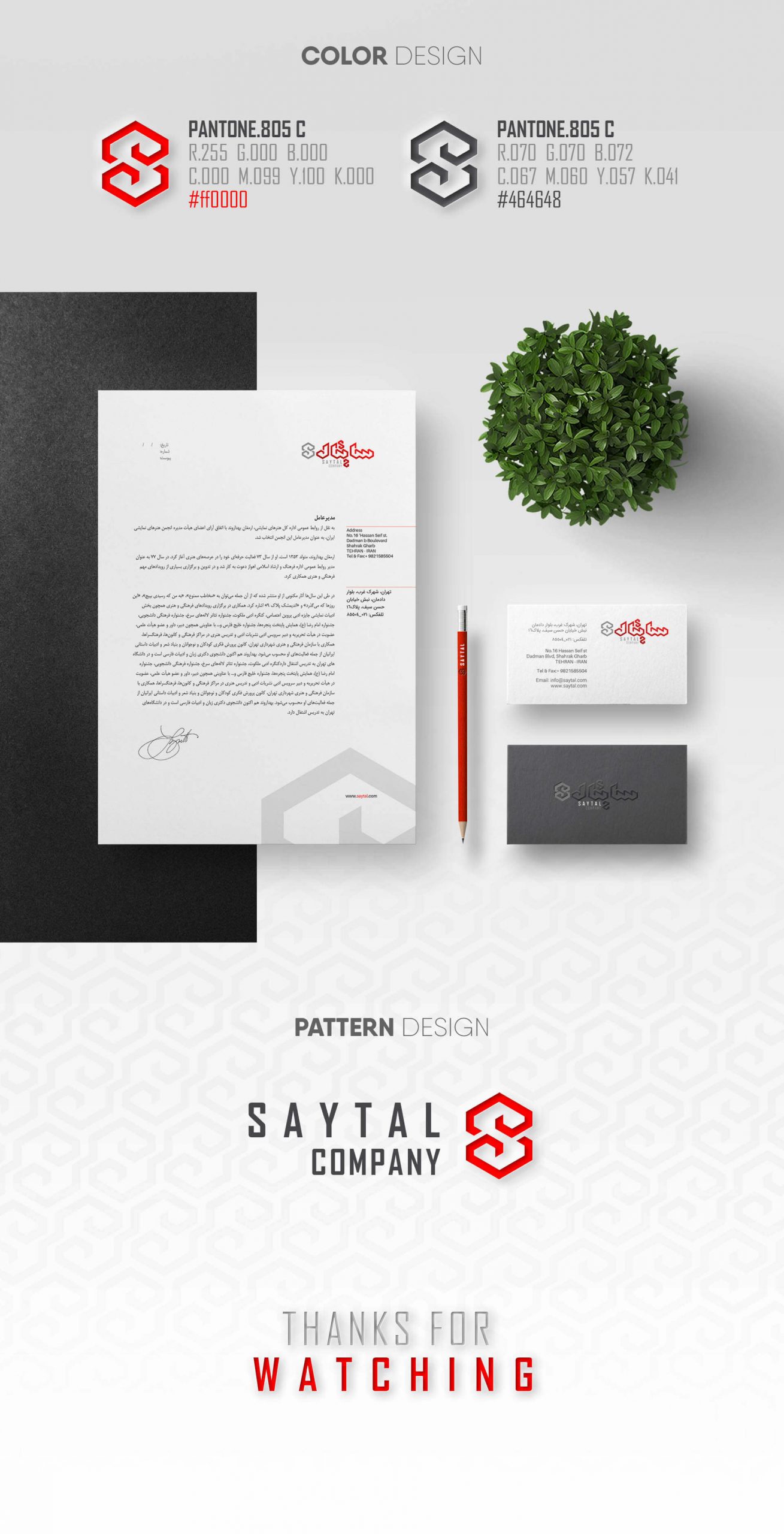
The hexagonal composition has been transformed into a super unit and the logotype has been designed using it, which has a very good fit with the logo of this brand. The color used in designing the visual identity of this brand is the color of the old identity of this brand so that it can tie the eyes and mind of the audience to the well-known signs of the brand in the past.
Another prominent point in the visual identity design project of Saytal is its pattern design. The use of symmetrical forms of the Saytal logo in the design of the pattern has created the most harmony and uniformity between the elements and items of this project.
With their skill and taste, our colleagues in the studio have been able to extract the appropriate pattern from the logo and depict it beautifully.
You can see some of the visual identity items of the Saytal Sakht’s branding project below.
The Project ID:
The Project’s Year:
2015
Field of Activity:
Building Construction
The Client:
Saytal Sakht (Construction) Company
Project items:
Logo & Logotype
- Logo Design
- FA Logotype Design
Basic Elements
Layout
- Trademark Layout
- Horizontal FA Trademark Layout
- Vertical FA Trademark Layout
Safety Area
- Logo Safety Area
- FA Trademark Safety Area
Colors
- Basic Colors CMYK/RGB/Pantone/Hex
Color Modes
- CMYK/RGB
- Grayscale
- Bitmap
Typeface
- Master FA Typeface
- Master ENG Typeface
- Secondary ENG Typeface
Pattern
- Pattern Design
Stationary Systems
- Business Card
- A4 Letterhead
- A5 Letterhead
- Envelope
- A4 Envelope
- CD Cover Design
- CD Design
- Notebook
Sample Applications
- Stamp
- Shopping Bag
- Flag Design
- Mouse Pad Design
- Mug Design
- Badge
Grids
- PowerPoint Grid
- Poster Grid
- Ad & Newspaper & Magazine Grid
- Billboard Grid
- Bridgeboard Grid
- Lamppost Grid
- Standard Grid
Layout Grids
Brochure Layout Grid
- Cover Grid
- Internal Pages Grid
Catalogue Layout Grid
- Cover Grid
- Internal Pages Grid
Environmental Design
- Wayfinding System
- Indoor Wayfinding system details & Materials
- Hanging Signage
- In Corner Signage
- Out Corner Signage
- Column Signage
- Elevator Signage
- Facade Signage
- Out Door Signage
Online
Basic Elements In Online Media
- Logo & Logotype
- Colors
- Typeface
Website
- FA Email Signature
- ENG Email Signature

