The Concept Behind Visual Identity and Grid Design of Niktan Brand
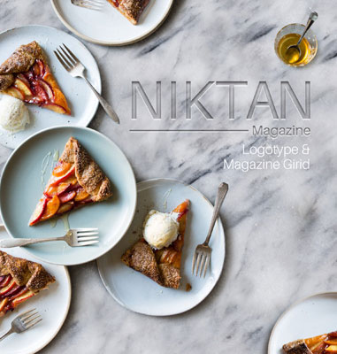
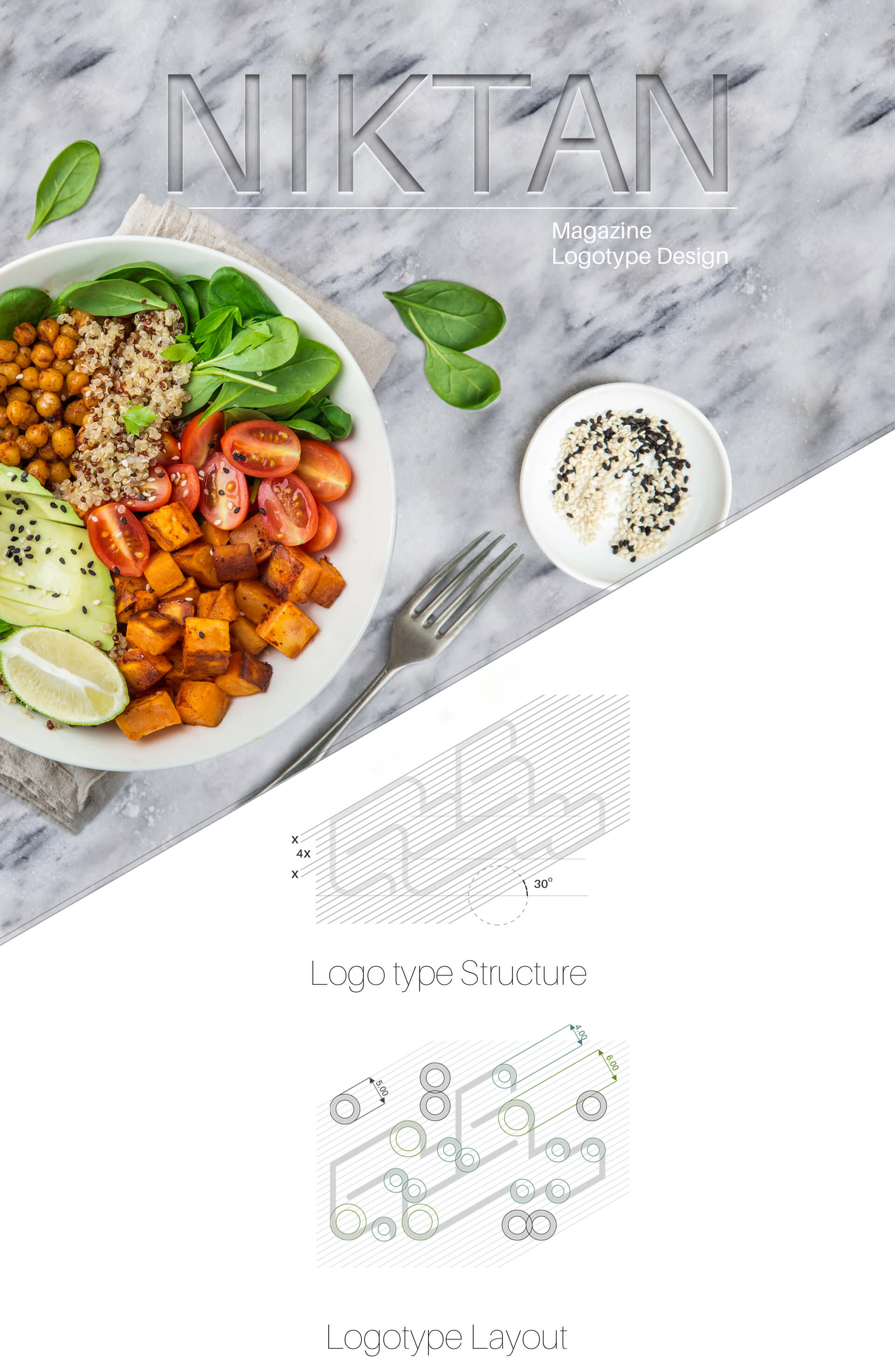
Niktan is the magazine which is working in healthy foods field. What this brand needed was creating its visual identity and grid designing. Visual identity of Niktan brand is based on visual items an designed according to printing needs.
The logotype designed for this brand, due to its very strong structure, is one of the attractive designs of Alef Design Agency. This logotype has many highlights, the most important one is its softness despite having geometric structure.
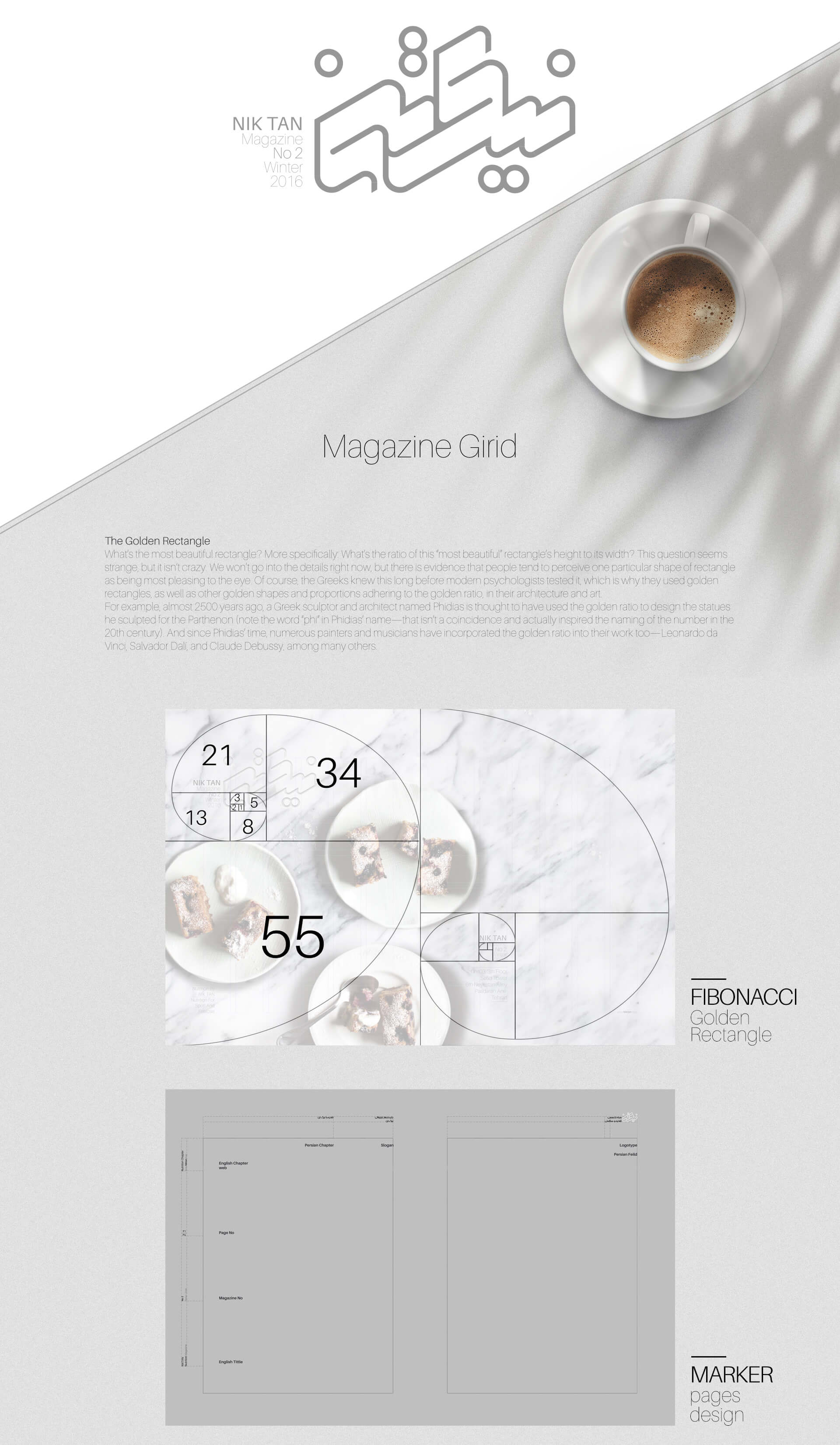
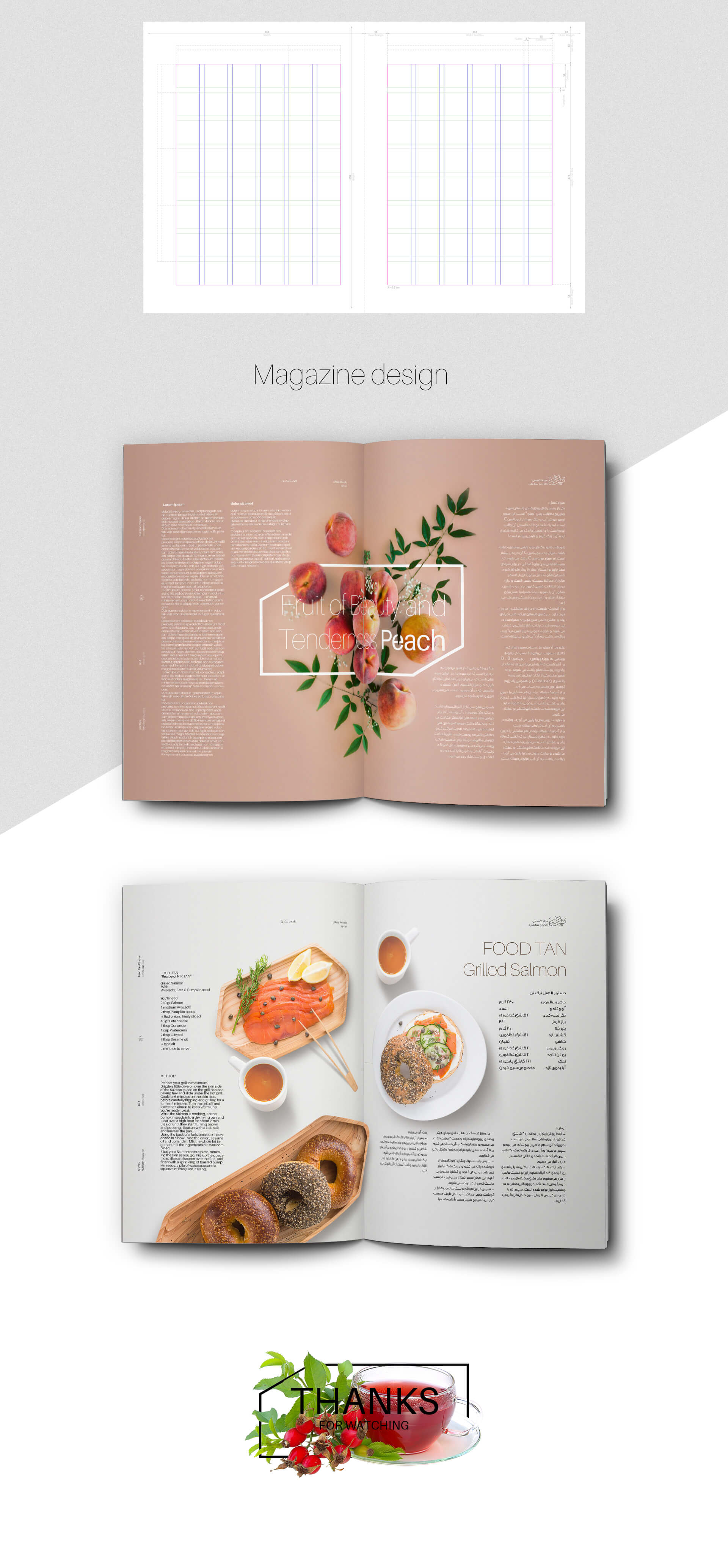
Fibonacci’s golden proportions are used in the designing process of this brand’s grid. Some historians consider the lifespan of Fibonacci ratios to be equal to human life. Many artists whose works have been preserved in history have knowingly used this combination in their works. Mastering this powerful tool and ability to use it can have very positive effects on the audience. In the grades of the Niktan brand, this composition is the basis of the design, and the design frameworks are specified by using it.
Project ID:
The Project’s Year:
2017
Field of Activity:
The Press, Magazine
The Client:
Niktan brand
Project type:
Visual Identity Design – Magazine Grade
Project items:
Logo and Logotype
- FA Logotype Design
Basic Elements
Layout
- Trademark Layout
- Logo Color Usage
- Horizontal FA Trademark Layout
- Vertical FA Trademark Layout
- Logo Master Alternate Usage (Print/Digital)
Safety Area
- Basic colors CMYK\RGB\Pantone\Hex
Color Modes
- CMYK/RGB
- Grayscale
- Bitmap
Surface and Frame
- Surface and Frame Design Standard and Definition
Layout Grids
Magazine Layout Grid Design
- Cover Grid Design
- Contents Grid Design
- Internal Pages Grid

