The Visual Identity Concept of Loomir’s Brand
Loomir operates in import, distribution and sale of kitchen units. At the beginning of their activity, this brand designed a visual identity to develop a brand-book. This project is popular and attractive in our agency due to new ideas and concepts and diverse identity items.
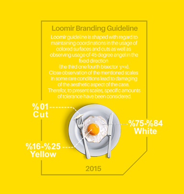
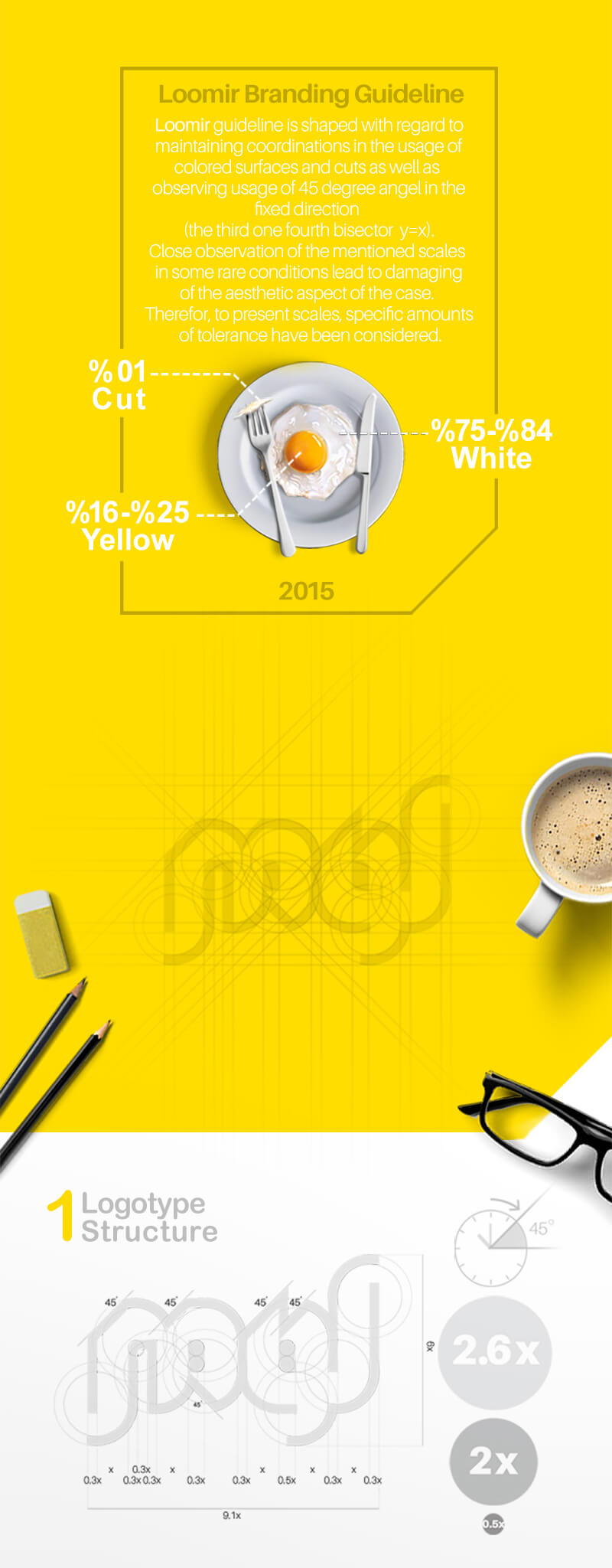
In designing the visual identity of the Loomir brand, we used mathematical proportions. In all the designed items, which are more than 50 items, 75 to 84% of the color volume in white images and 16 to 25% of the color volume in yellow images. 1% is also considered for the cut space.
Due to the kindness and trust they had in our agency, the managers of this brand provided us with a pleasant cooperation experience, and fortunately, we got an acceptable result in the Loomir branding project.




The Project ID:
The Project’s Year:
2015
Field of Activity:
Kitchen Units
The Client:
Loomir
Project Type:
The Visual Identity Design (Branding)
Project items:
Logo & Logotype
- FA Logotype Design
- ENG Logotype Design
Basic Elements
- Safety Area Definition
- Layout Definition
- Color Definition
- Modes Definition
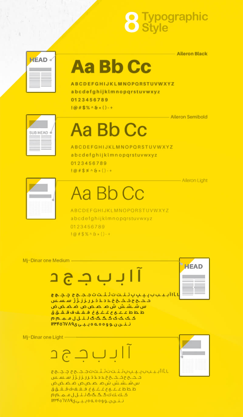
- Typeface Definition
- Do & Do Not’s Definition
- Pattern Definition
- Surface & Frame Definition
- Pictogram Definition
Stationary Systems
- A4 Letterhead
- A5 Letterhead
- CD & CD Cover
- A4 Envelope
- Notebook
- Business Card
Grids
- Catalogue Grid Design
- Pictogram Grid Design
Sample Applications
- Shopping Bag
- Badge
- Store Sign Design
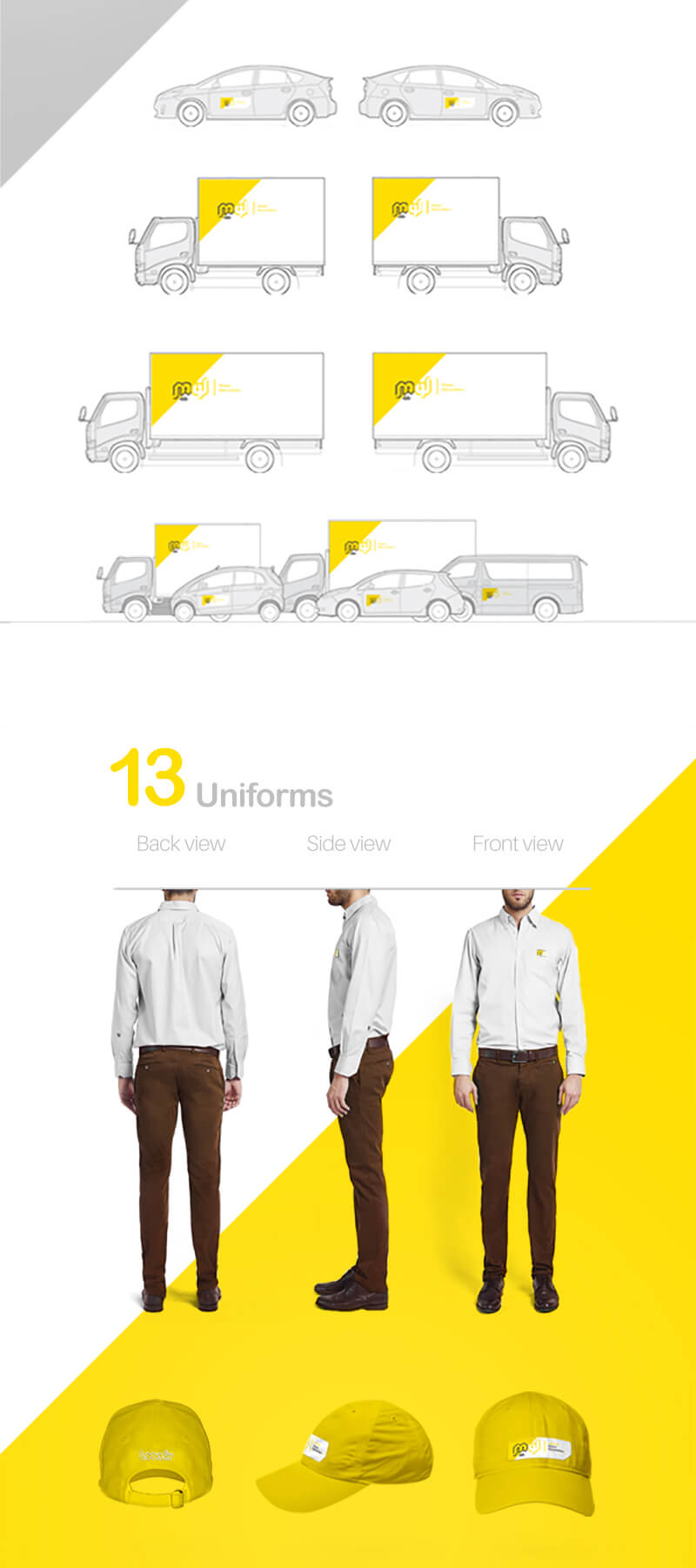
- Personnel Uniforms Design
- Folder Design
- Catalogue Design
Digital Elements
- Email Signature Design
Environmental Design
- Lamppost Design

