The Concept Behind LILIA’s Brand Identity Design
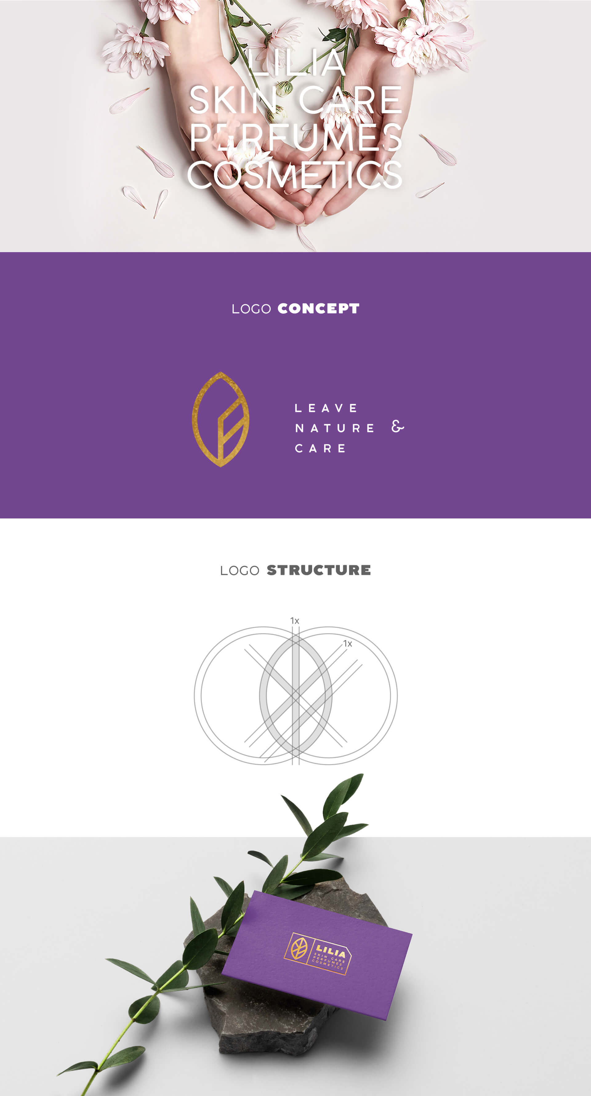
“LILIA” is the cosmetics store in Ahvaz, Iran. They decided to change their visual identity design and review their past identity.
The field of activity of this brand brings considerations in developing ideas for it. As beauty, cleanliness, luxury, up-to-datedness and quality were among those consideration.
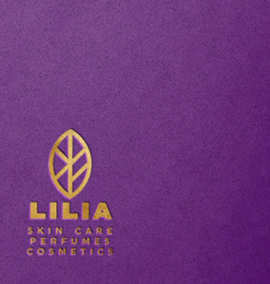
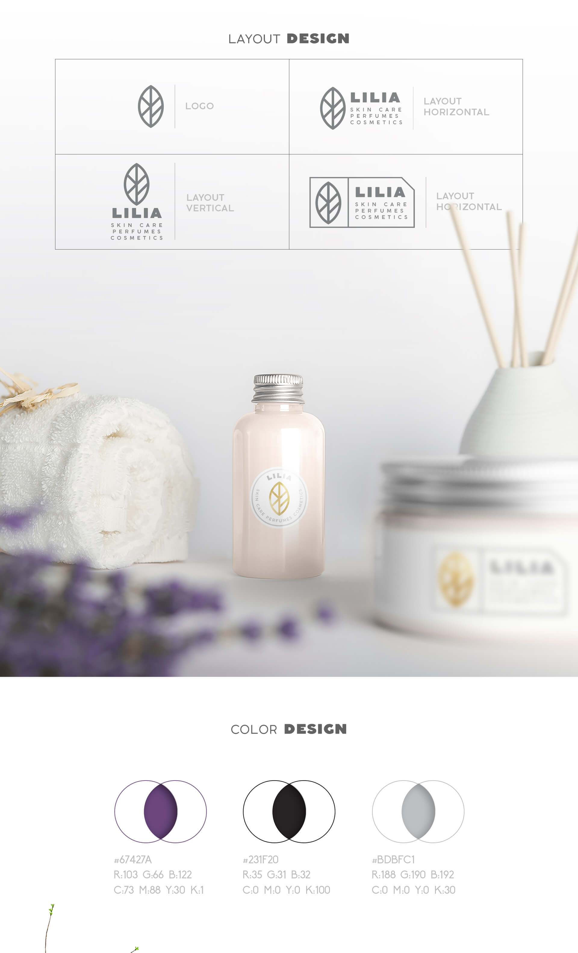
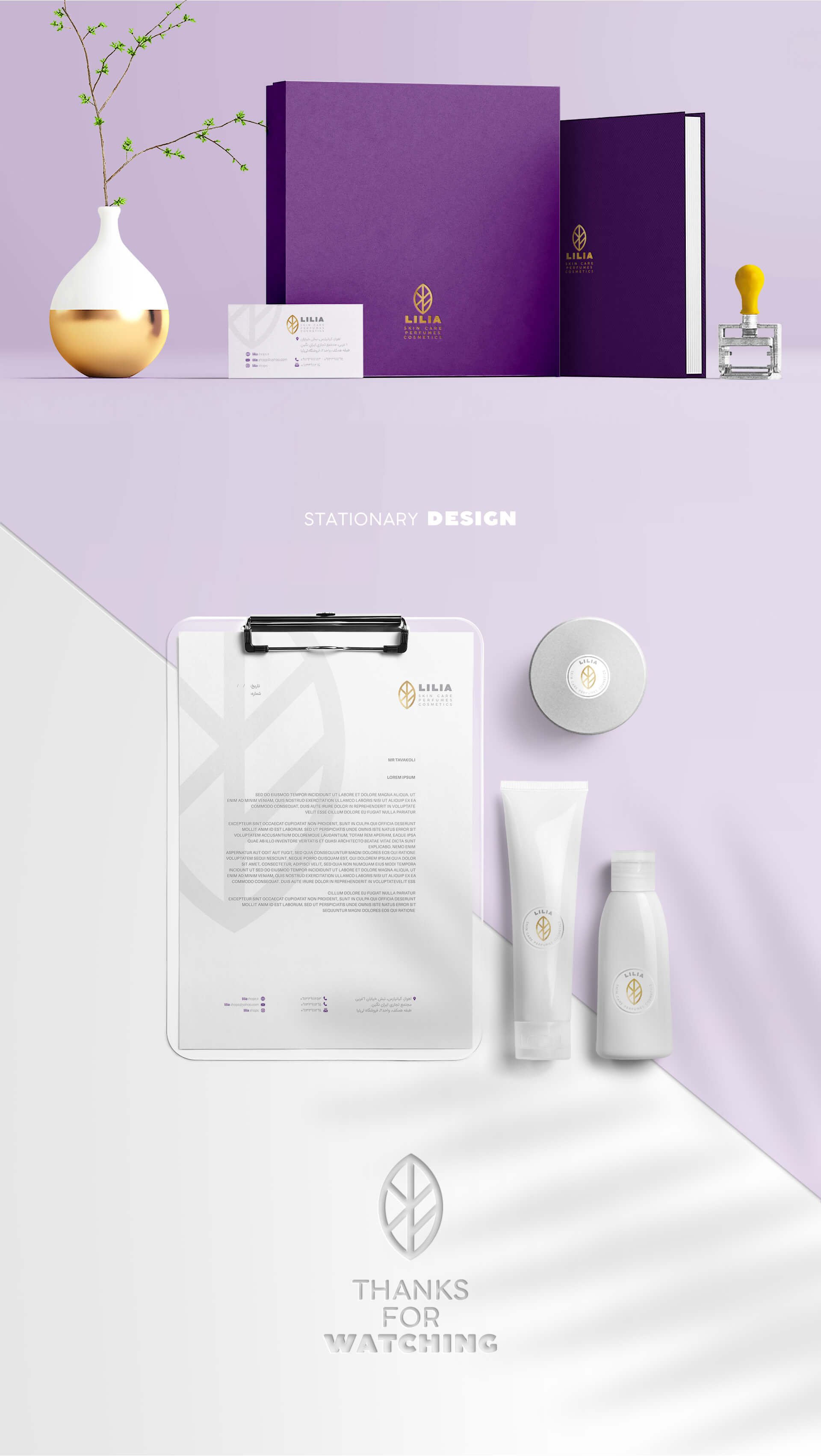
In the design of the visual identity of the Lilia brand, the leaves of the tree have been analyzed and with a new design approach, the desired elements of the brand have been included. The geometric structure of this brand’s logo is extracted from the intersection of two circles, which gives it a completely geometric, eye-catching appearance. The layout of the logo and logotype vertically and horizontally has brought the closest image to the needs of this brand. The number of visual identity items in this project is less than some projects in our collection. But because of its visual appeal, it is among our favorite projects.
Project ID:
The Project’s Year:
2018
Field of Activity:
The Cosmetics
The Client:
LILIA brand
Project type:
Visual Identity Design (Branding)
Project items:
Logo and Logotype
- FA Logotype Design
- EN Logotype Design
Basic Elements
Layout
- Trademark Layout
- Logo Color Usage
- Horizontal ENG Trademark Layout
- Vertical ENG Trademark Layout
- Logo Master Alternate Usage (Print/Digital)
Safety Area
- Logo Safety Area
- ENG Trademark Safety Area
Colors
- Basic Colors CMYK/RGB/Pantone/Hex
- Secondary Colors CMYK/RGB/Pantone/Hex
- Neutral Colors CMYK/RGB/Pantone/Hex
- Gradient Colors CMYK/RGB/Pantone/Hex
- Logo Do and Do Not’s
Color Modes
- Colored RGB/CMYK
- Grayscale
- Bitmap

