The Visual Identity Concept About Karbazia’s Brand (Proposed Plan)
Karbazia established at Milad Tower in 2018. Developing children’s skill and career talent during playing games is the new and attractive idea of Karbazia’s business. The Karbazia visual identity project has been implemented and completed before the launch.
In this collection, various jobs has been reconstructed in order to familiarize children and teenagers with work and effort in the working environment. The main target of this business is based on global experiences in growth and by cultivating individual and collective abilities of children and adolescents which includes the age of 2 to 13 years old.
In this project we focused on visual identity of the elements and specific factors of this brand and during the project basic consideration has been made in order to achieve its design path with determination.
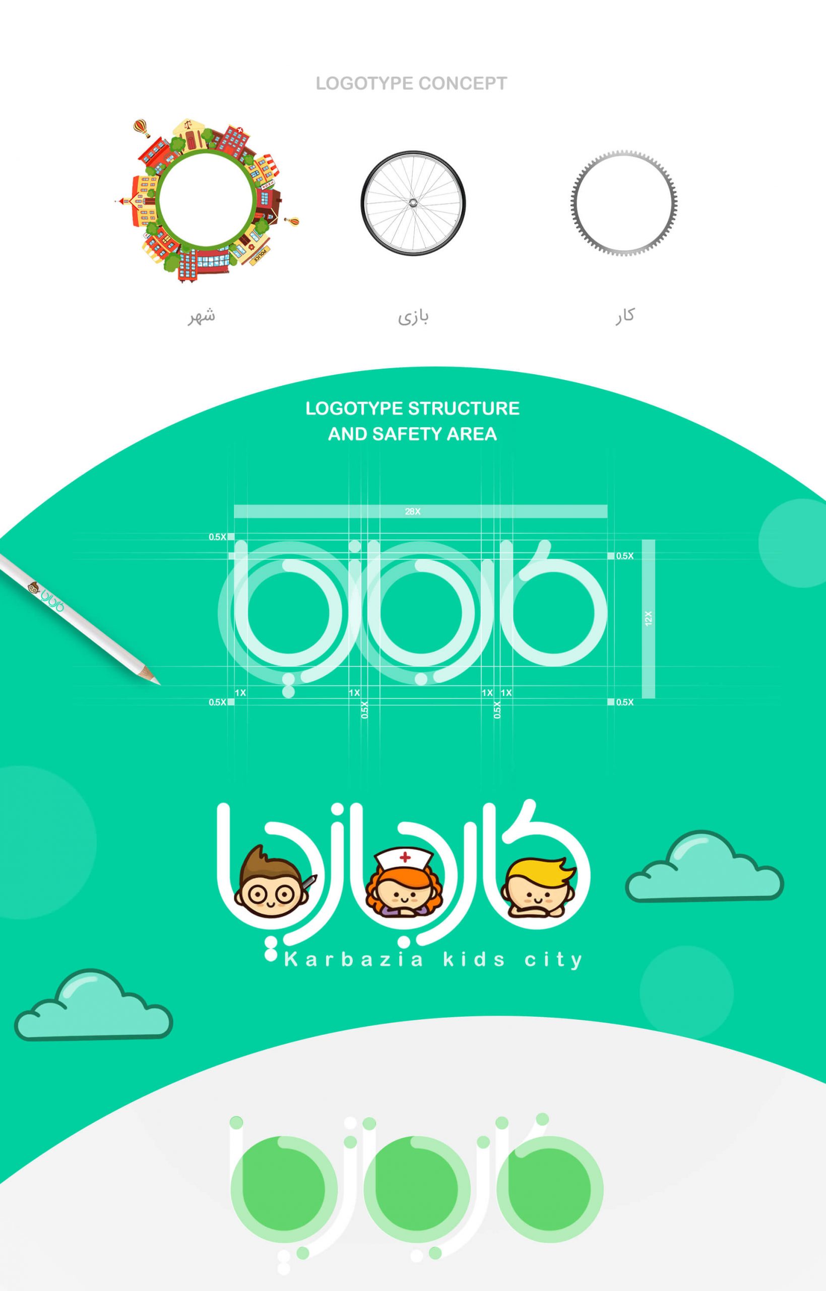
The structure of the logotype design is circles that symbolize the dynamism and movement of the earth. Referring to the earth, these circles are also considered a symbol of life and yard.
We used soft forms in the design of the visual identity items and the logotype of the brand as we tried to be as close as possible to children’s illustrations so that the structure of the visual identity is appropriate to the field of activity and its audience.
The target audience is divided into two categories; The first category is children and teenagers, who are also in first priority, and the second category is parents and considerations of these two categories of audience are considered so the result of the work has the greatest impact on them in all items of visual identity that we created.
Highlights
One of the highlights of this project is sending the message of children’s growth and development to parents by “Karbazia” brand. In order to parents get the process of growth and development of their children from the collection of visual identity items of “Karbazia” brand.
Another feature of “Karbazia” brand’s visual identity brand is to show self confidence, effort and teamwork during the game that includes the joy and excitement of children. This interpretation is exactly in accordance with the desire and purpose of “Karbazia” brand activities.
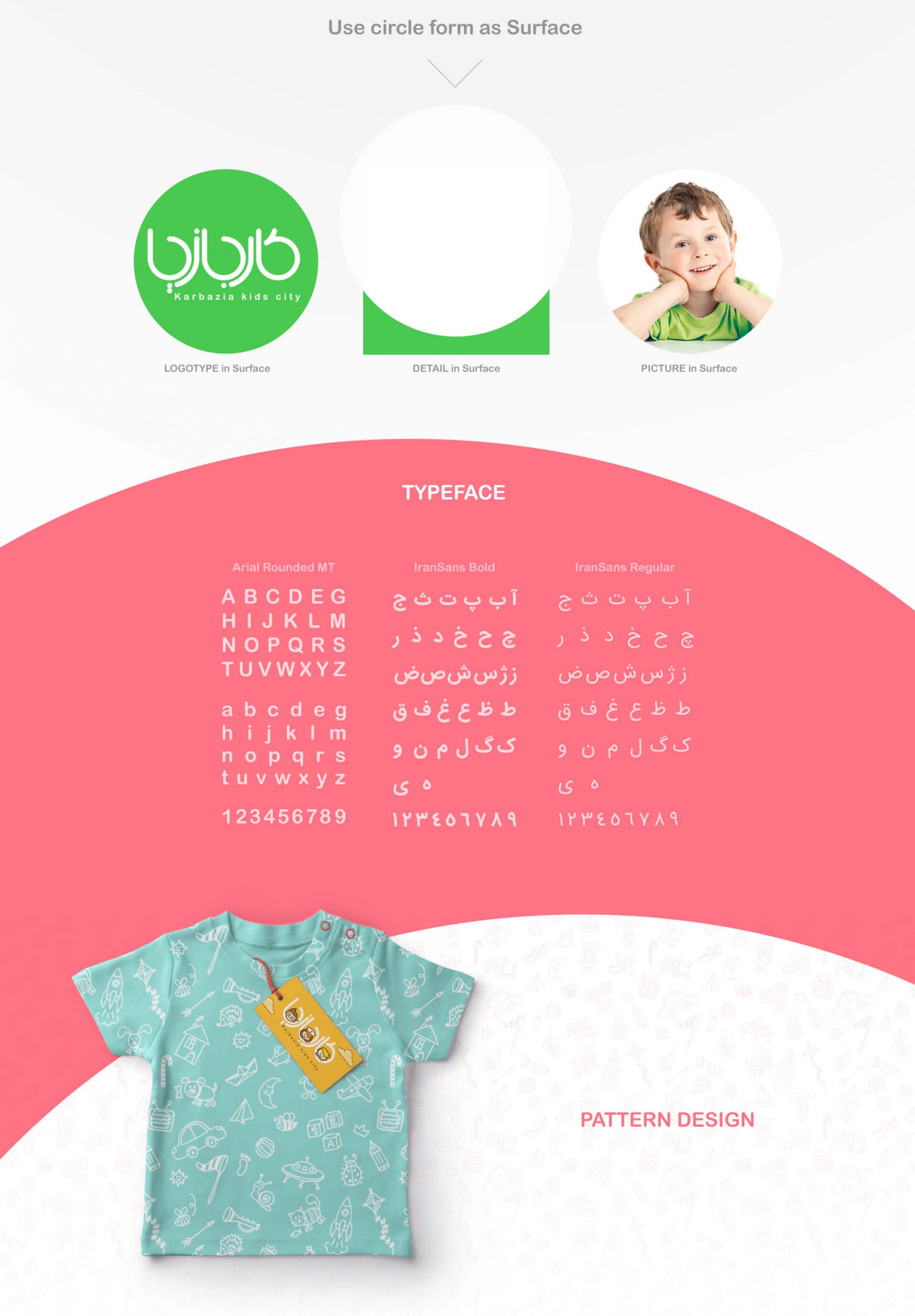
In the designing process we used happy and lively colors in the environmental graphics and other items so that the audience (children and parents) can experience the feeling of being in an environment of full energy and excitement.
This project is placed in the category of designing the visual identity of children and teenagers and a large number of illustrations in designing the visual identity of businesses have been designed and implemented for it.
In addition to the visual identity booklet which is also called the brand book, this project has a 3 minutes motion graphic, which displays part of the visual identity items that we designed for the “Karbazia” brand in the majority of the video.
The Project ID:
The Project’s Year:
2018
Field of Activity:
Children’s Job City (The city game with a skill approach for children)
The Client:
Karbazia
Project Type:
The Visual Identity Design (Branding)
Project items:
Logo & Logotype
- FA Logotype Design
Basic Elements
Layout
- Trademark Layout
- Logo Color Usage
- Horizontal FA Trademark Layout
Safety Area
- FA Trademark Safety Area
Colors
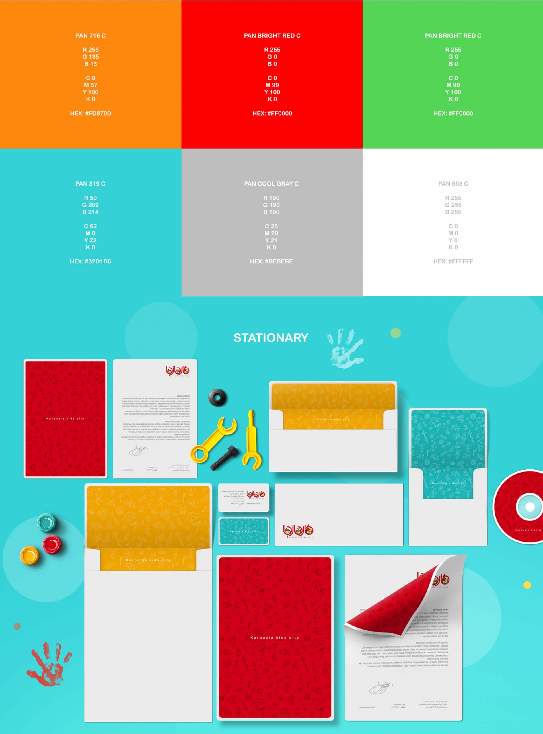
- Basic Colors CMYK/RGB/Pantone/Hex
- Secondary Colors CMYK/RGB/Pantone/Hex
- Neutral Colors CMYK/RGB/Pantone/Hex
Color Modes
- CMYK/RGB
- Grayscale
- Bitmap
Typeface
- Master FA Typeface
- Master ENG Typeface
- Headline Subhead Body Copy
Surface and Frame
- 15 Icons Designed
Pattern
- Pattern Design
Stationary Systems
- Business Card
- A4 Letterhead
- A5 Letterhead
- Envelope
- A4 Envelope
- A5 Envelope
- Business ID Card
- CD Cover Design
- CD Design
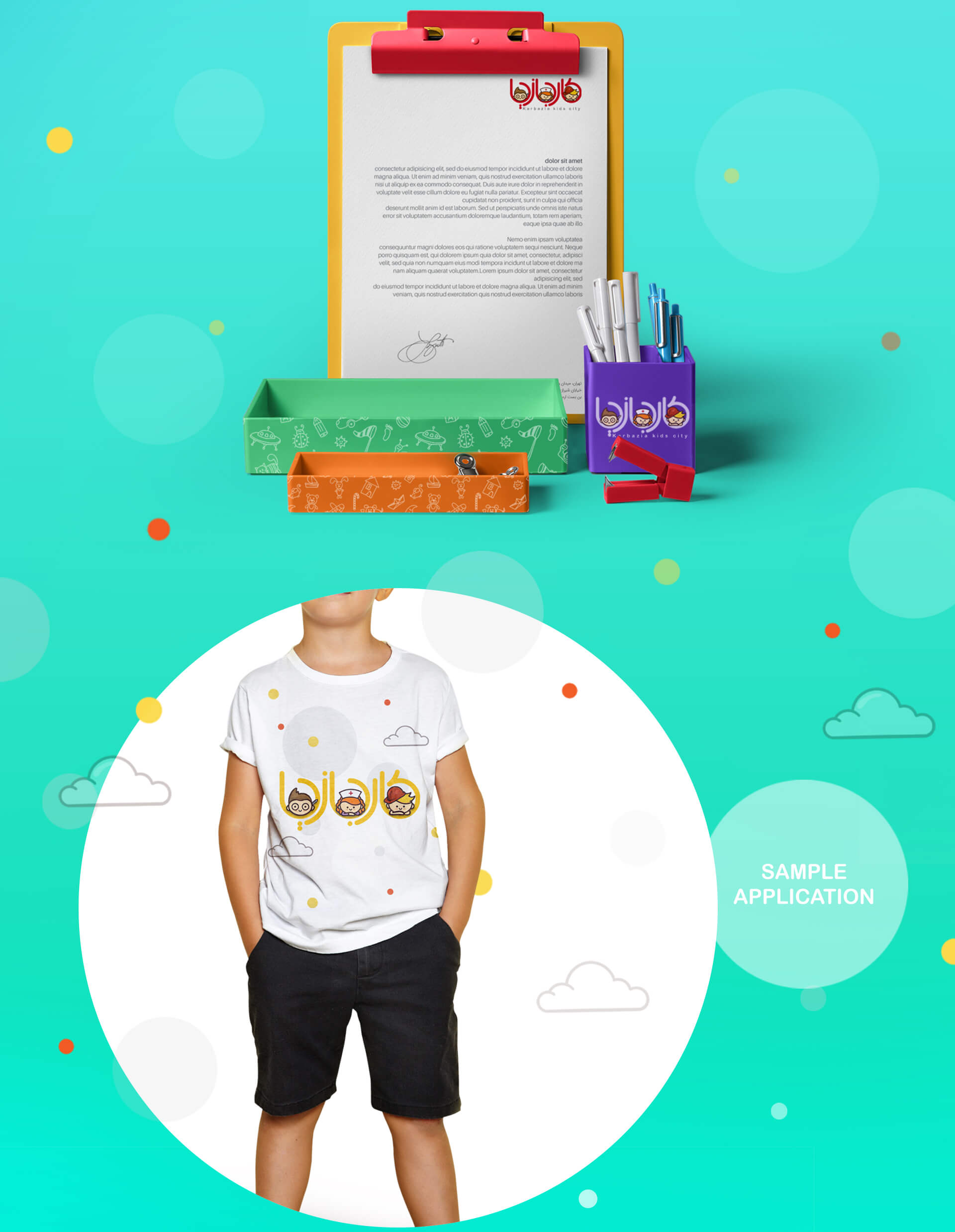
Sample Applications
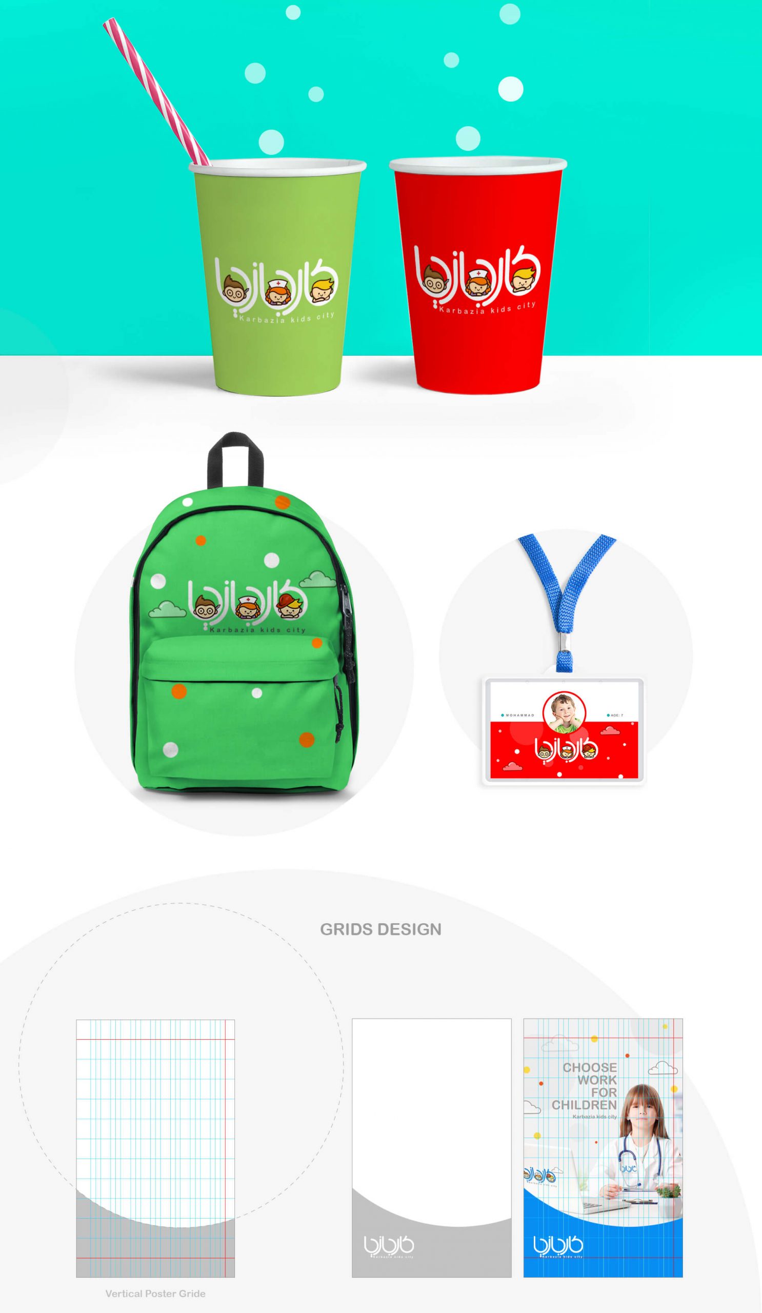
- Mug Design
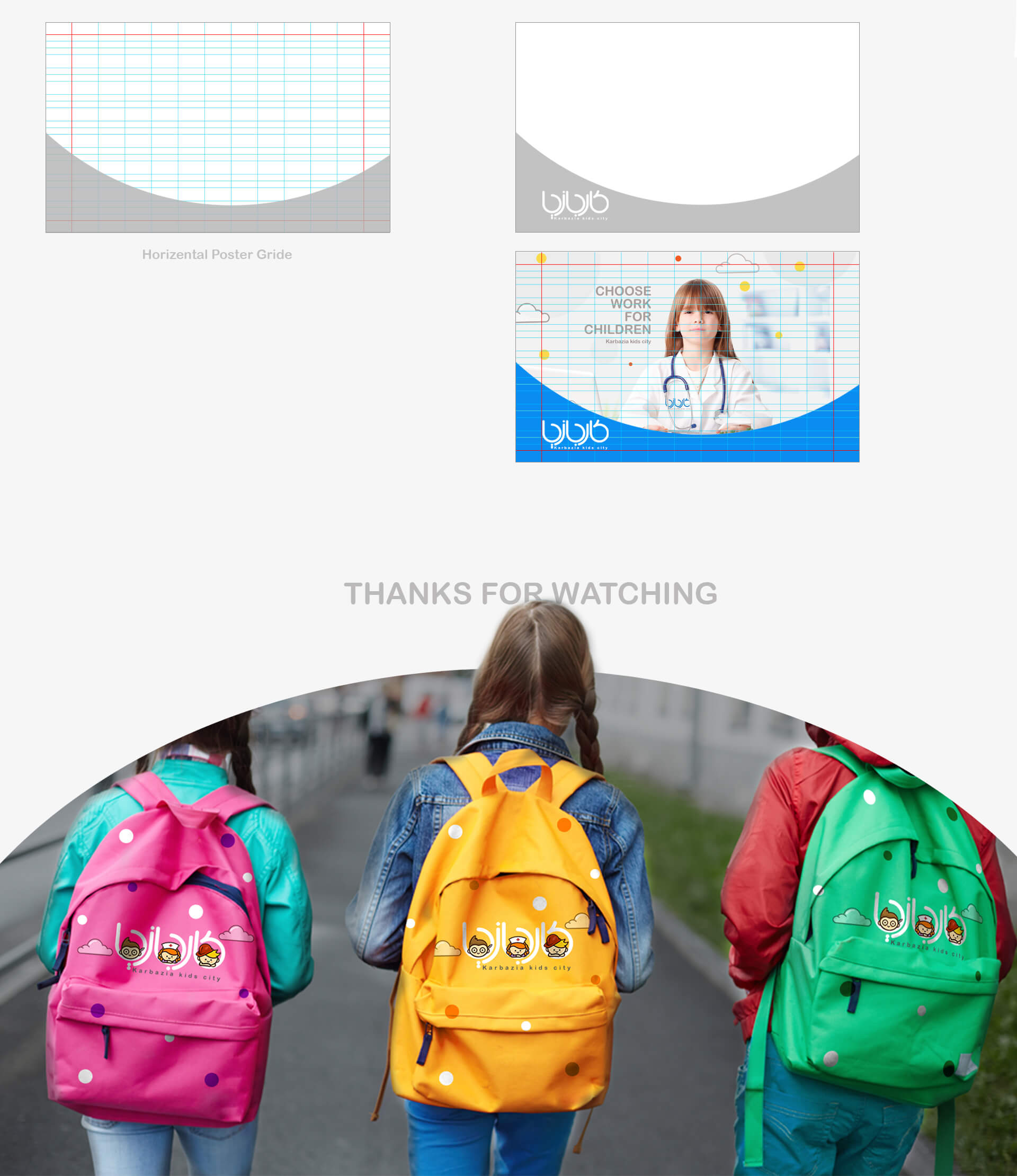
Grids
- Poster Grid
- Ad Stand Grid
- Ad & Newspaper & Magazine Grid
Motion Graphic
- Logo Motion
- Logo Wipe

