The Visual Identity Concept Behind Jojoc Restaurant
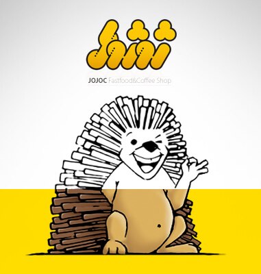
Jojoc means hedgehog in Kurdish. The name of Jojoc was chosen for this brand before the implementation of the branding project and visual identity design.
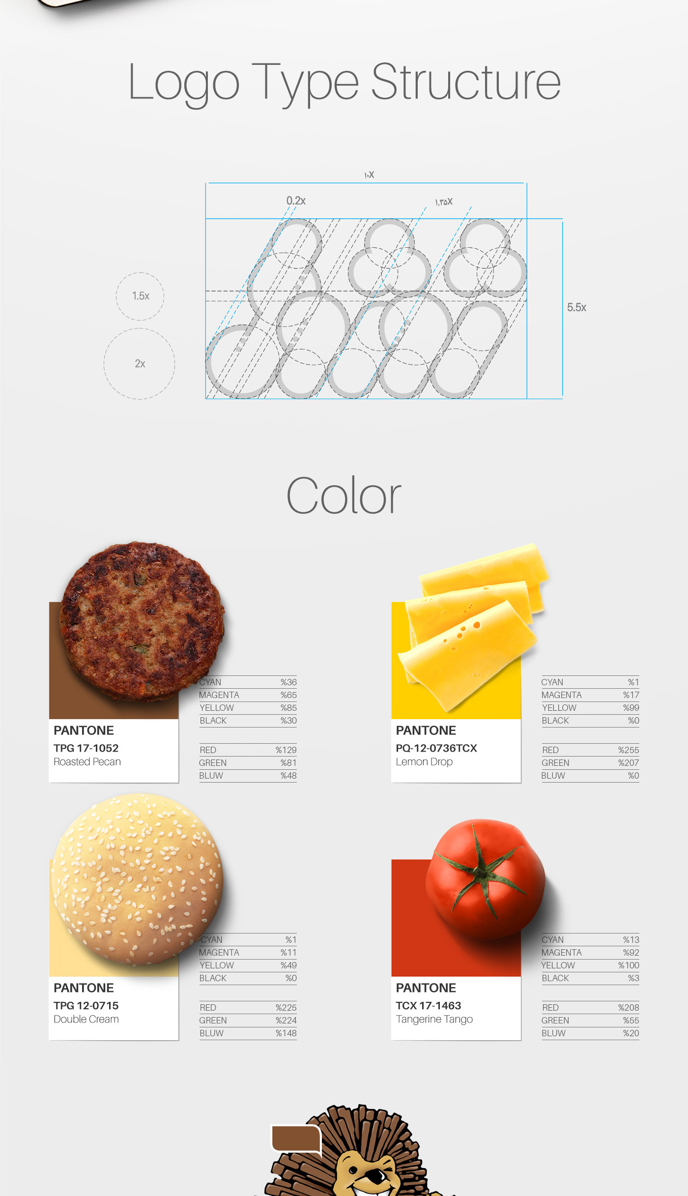
One of the most prominent points related to the design of the visual identity of this brand is the use of colors and materials of the products, including hamburger for brown color, baguette bread for cream color, pizza cheese slices for yellow color and tomato for red color in defining the brand colors to form the most compatibility and impact in the minds of its audience. The regular and geometric structure used in the logotype design of this brand is also one of its strengths, which is very soft and eye-catching.
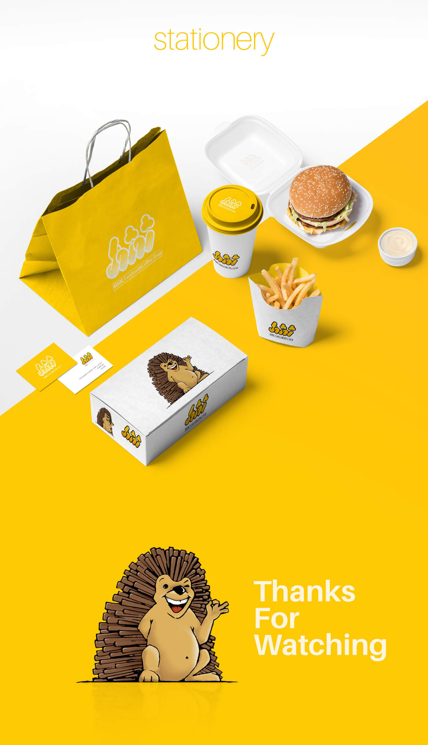
One of the most important items of the visual identity of this brand is its packaging collection. In packaging design, considering the price to reduce costs and lower the cost is one of the strategies of this brand that has been well applied in the project.
The Project ID:
The Project’s Year:
2017
Field of Activity:
Restaurant and Fast Food
The Client:
Jojoc
Project Type:
The Visual Identity Design (Branding)
Project items:
Logo & Logotype
- FA Logotype Design
Basic Elements
- Safety Area Definition
- Layout Definition
- Color Definition
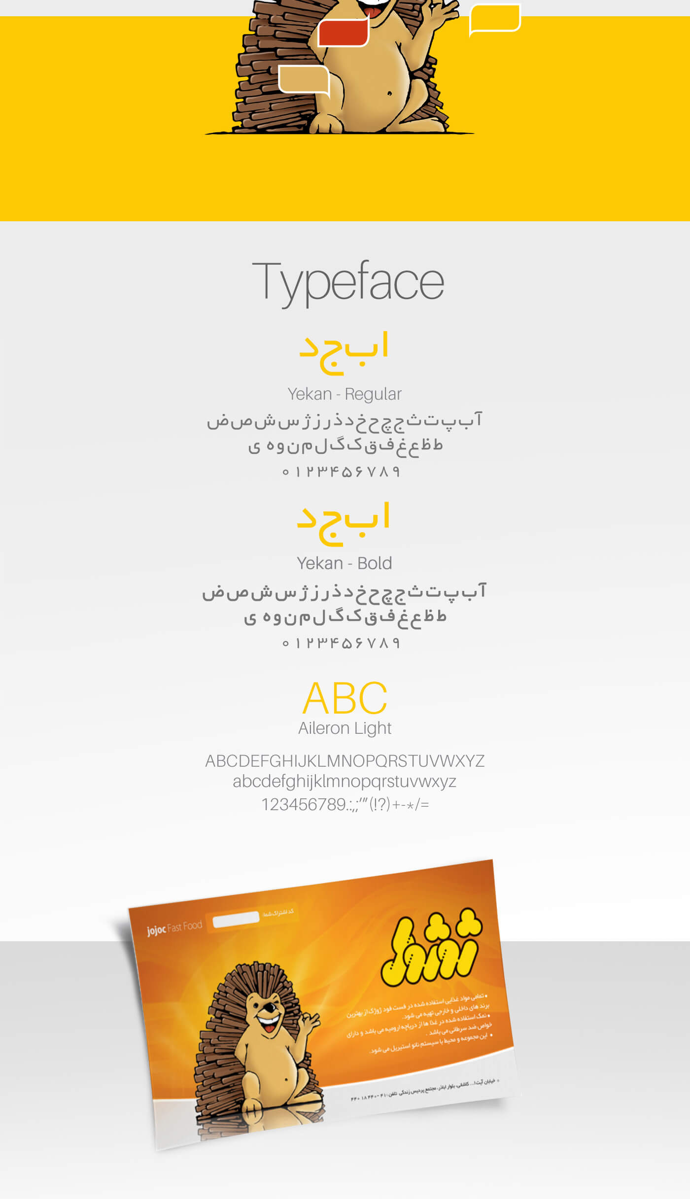
- Font Definition
- Mode Definition
- Correct & Incorrect Identity
- Pattern Design
- Mascot Design
Stationary Systems
- A4 Letterhead
- A5 Letterhead
- A4 Envelope
- Envelope
- Business Card
- Subscription Card
Grids
- Catalogue Grid Design
- Brochure Grid Design
Sample Application
- Shopping Bag
- Stand
- Packaging Design
- Restaurant Menu Design
Digital Elements
- Email Signatures Design

