Institute for Development of Creative Math Scholars’s Visual Identity Concept
We did this project in 2018. The Institute for Development of Creative Math Scholars started working as a specialist in the field of education in 2018 as they wanted to achieve their branding goals and the designing the concept and visual identity.
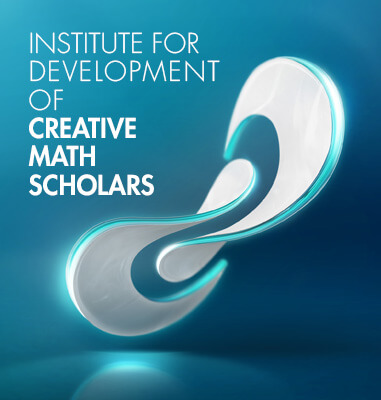
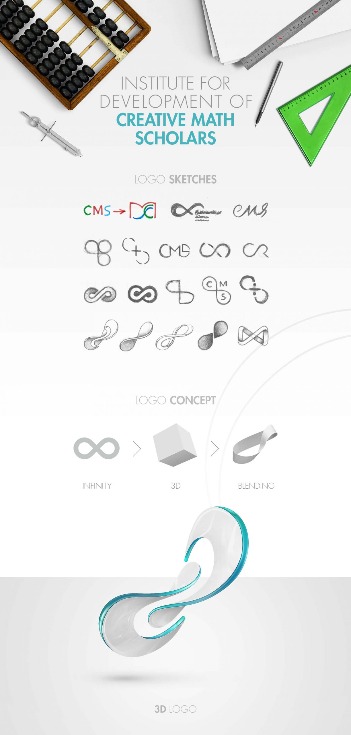
This project has three main elements. The first element is infinity sign which is symbol of infinity number in mathematics but other meanings are also considered. In the past, rulers and sultans gave the symbol of infinity to the great alchemist and it means that he has reached an infinite level in occultism and had a high power to create a balance of forces.
This symbol has a two-dimensional face and personality. On the other hand, in the middle of the symbol, these two dimensions are connected, which is a sign of the art of alchemy and the combination of material and non-material dimensions. The use of this symbol in the concept of the visual identity of the brand, on the one hand, refers to the field of activity of this institution (mathematics) and on the other hand, the skill and power of this brand to improve the level of information of its customers.
The second element is the circulation with flexibility that is a symbol of flexibility, circulation and dynamism, which is suitable for the field of activity of this very efficient brand.
The third element is the 3D dimention that helps to make the main concept real and believable.
The Design Highlights
The project is very attractive and beautiful due to the power of the concept and the use of a large number of techniques.
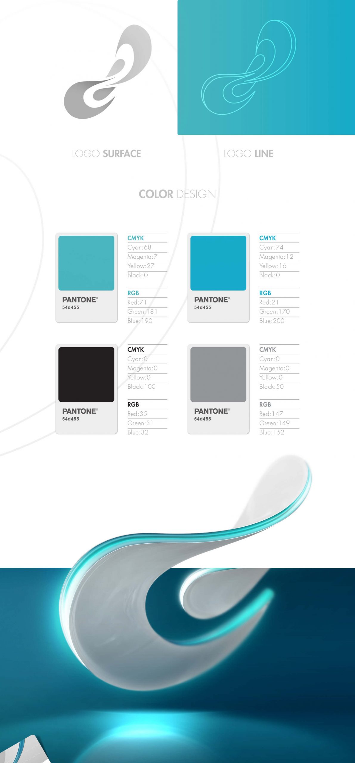
- We used white and green-blue color. The white color is refers to knowledge and awareness and the green-blue color is used for the education section so the
combination of two colors together indicates the field of activity of the brand.
- The basis of the visual identity of this project is designed and executed in 3D and depending on the need and for use in spaces where it is not possible to implement 3D, it is also designed and implemented as a line and surface.
- Transparent material has been used for the edges of the logo, which has helped the effect to be attractive with lighting.
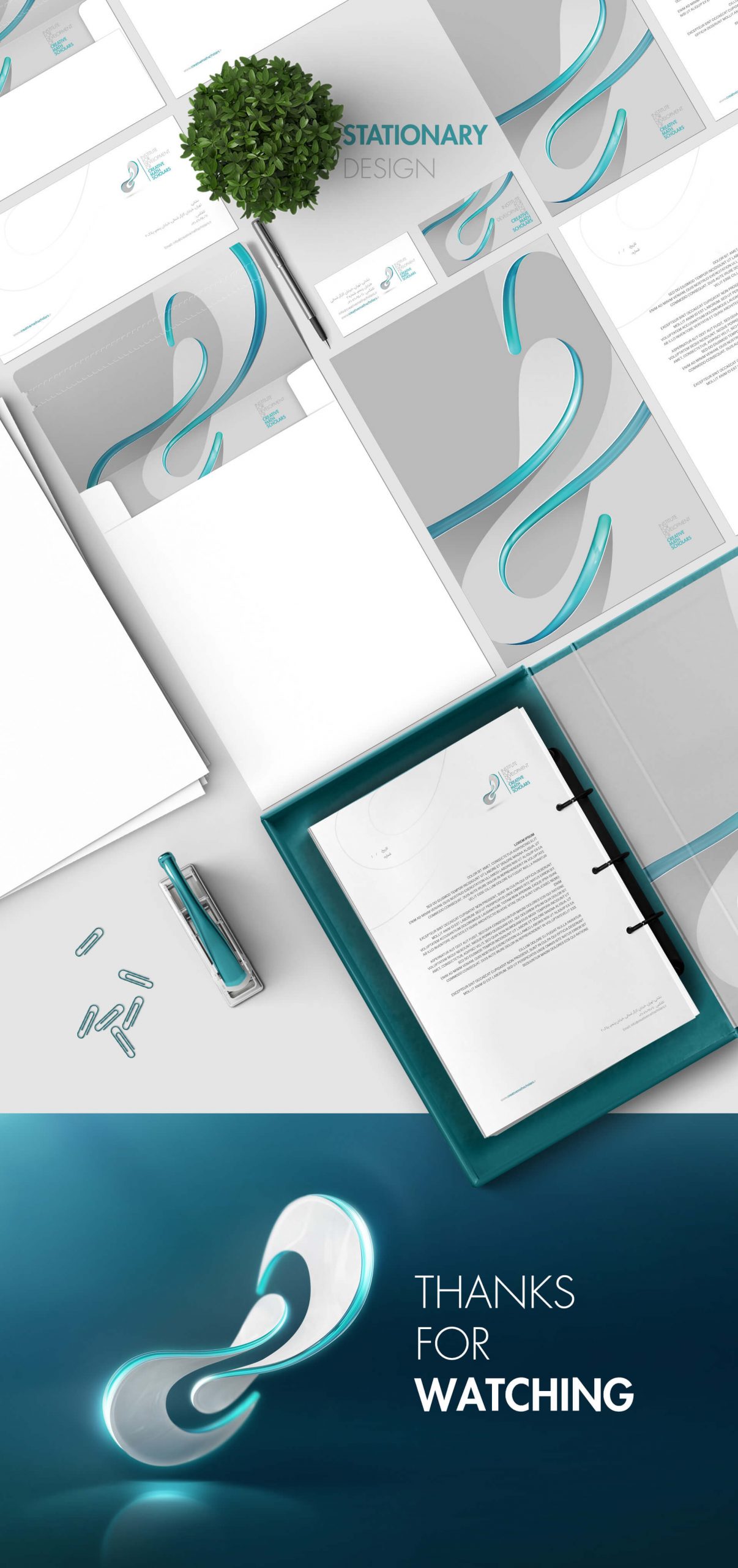
- The designed logo has various and practical details for use in visual identity items due to the attractiveness of its form and color. These details have been carefully extracted and used from selected parts of the logo.
The Project ID:
The Project’s Year:
2018
Field of Activity:
School of mathematics
The Client:
The Institute for Development of Creative Math Scholars
Project Type:
The Visual Identity Design (Branding)
Project items:
Logo & Logotype
- Logo Design
- FA Logotype Design
Basic Elements
Layout
- Trademark Layout
- Logo Color Usage
- Horizontal FA Trademark Layout
- Vertical FA Trademark Layout
- Horizontal ENG Trademark Layout
- Vertical ENG Trademark Layout
Safety Area
- Logo Safety Area
- FA Trademark Safety Area
- ENG Trademark Safety Area
Colors
- Basic Colors CMYK/RGB/Pantone/Hex
- Secondary Colors CMYK/RGB/Pantone/Hex
- Neutral Colors CMYK/RGB/Pantone/Hex
- Neutral Colors CMYK/RGB/Pantone/Hex
- Gradient Colors CMYK/RGB/Pantone/Hex
Color Modes
- CMYK/RGB
- Grayscale
- Bitmap
Typeface
- Master FA Typeface
- Master ENG Typeface
Stationary Systems
- Business Card
- A4 Letterhead
- A5 Letterhead
- Envelope
- A4 Envelope
- Business ID Card
- Folder
- Notebook
- Invitation Card
- Greeting Card
Sample Applications
- Male and Female Office Uniform
Brochure Layout Grid
- Cover Grid
- Internal Pages Grid
Catalogue Layout Grid
- Cover Grid
- Internal Pages Grid
Magazine Layout Grid
- Cover Grid
- Contents Grid
- Internal Pages Grid

