The Concept Behind 35th Fadjr International Theater Festival’s Visual Identity
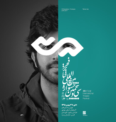
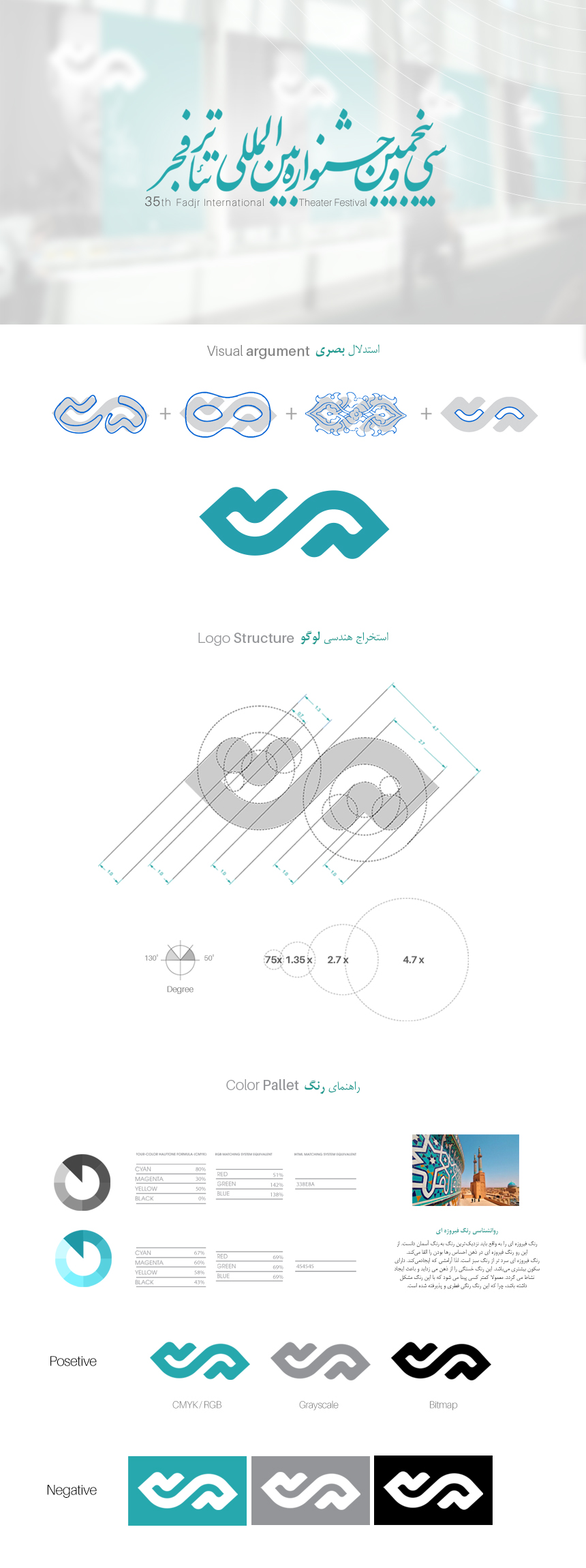
Ideas and designs for the poster of the 35th Fadjr International Theater Festival in the project of designing the visual identity of Fadjr Theater Festival started almost after the conclusion and the end of the 34th festival. During this period, many ideas and designs were etudes and some of them reached the implementation stage, but according to the work routine of Alef Design Agency, better ideas were still welcomed until in one of the etudes, which was worked on the number “35”, we reached a consensus this sign, together with theater audiences from different strata, ages and genders, can be the main concept of this course.
The design team looked for more visual connections in the sign “35” and with changes in the geometric structure, they designed the form to be a symbol of comedy and tragedy (smile and sadness). The authentic Iranians are very close and in addition, a sign for the new part of the festival (plus Fadjr) was also designed.
Elements of Visual Identity
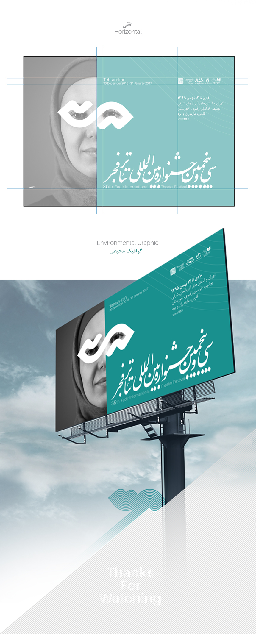
Another element that was added in the visual identity design and branding stages of this project was a surface that divided the poster space vertically into two parts and because we knew in advance that we were going to have two posters (Fadjr and Plus Fadjr) with the same structure, we used colors that contrast with each other and are close to Iranian culture. (Turquoise and Orange) but the visual issues related to a festival do not end with only one poster which has been like this until now and all the visual do and do not’s were designed in the form of visual identity in this period and this visual guide which includes the following are:


Project items:
Logo & Logotype
- Logo Design
- FA Logotype Design
Basic Elements
Layout
- Trademark Layout
- Logo Color Usage
- Horizontal FA Trademark Layout
- Vertical FA Trademark Layout
- The Logo Partnership Usage
- Logo Master Alternate Usage
- Logo Do & Do Not’s
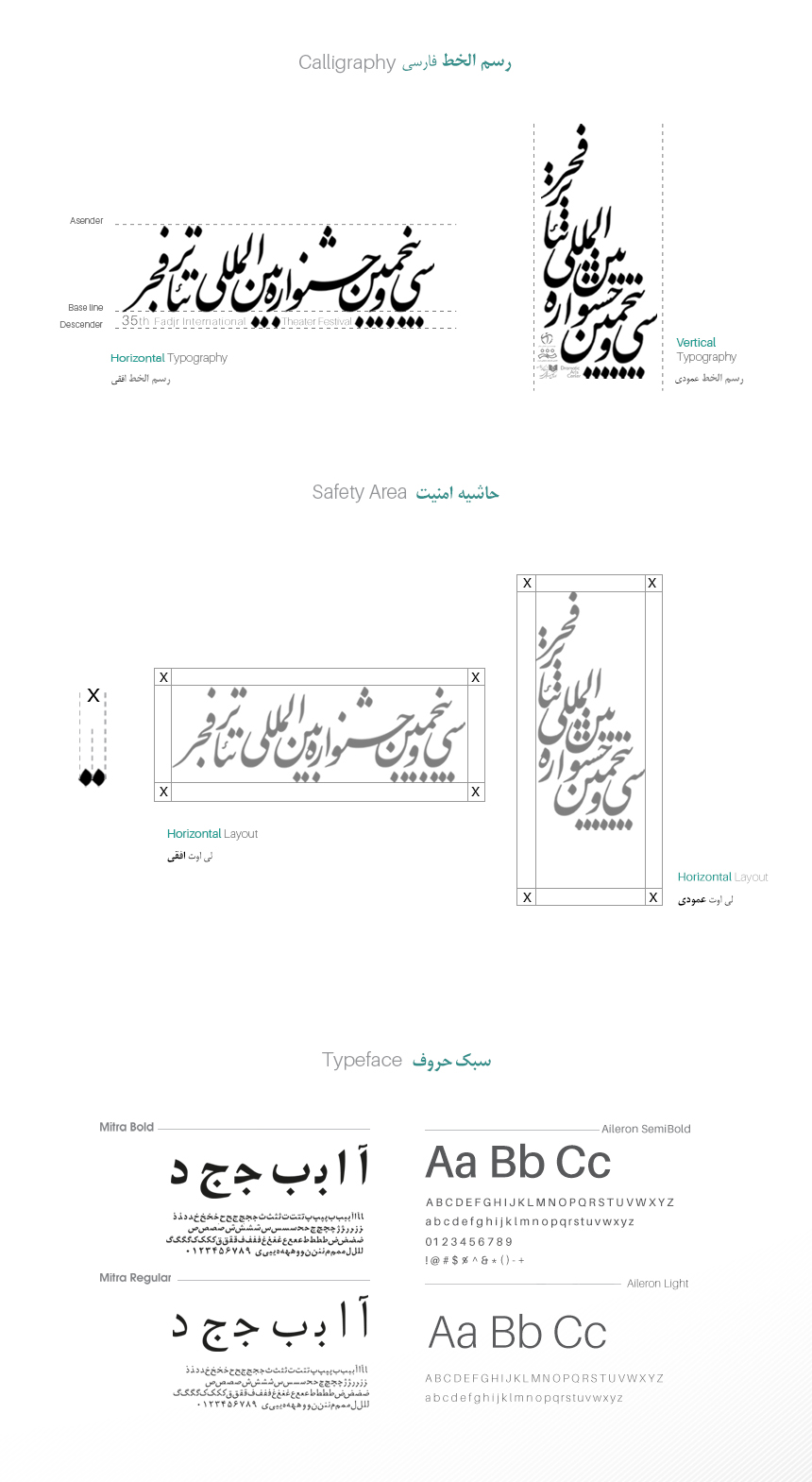
Safety Area
- Logo Safety Area
- FA Trademark Safety Area
Colors
- Basic Colors CMYK/RGB/Pantone/Hex
- Secondary Colors CMYK/RGB/Pantone/Hex
- Neutral Colors CMYK/RGB/Pantone/Hex
- Gradient Colors CMYK/RGB/Pantone/Hex
- Color Do & Do Not’s
Color Modes
- CMYK/RGB
- Grayscale
- Bitmap
Typeface
- Master FA Typeface
- Master ENG Typeface
- Secondary FA Typeface
- Secondary ENG Typeface
- Headline & Subhead & Body Copy
- Typography Hierachy
- Typography Do & Do Not’s
Surface and Frame
- Surface and Frame Design
Pattern
- Pattern Design
Stationary Systems
- Business Card
- A4 Letterhead
- A5 Letterhead
- Envelope
- A4 Envelope
- A5 Envelope
- Business ID Card
- CD & CD Cover
- Note
- Notebook
- Invitation Card
- Greeting Card
Sample applications
- Shopping Bag
- Fabric Shopping Bag
- Flag Design
- Badge
Grids
- Poster Grid
- Ad Stand Grid
- Billboard Grid
- Bridgeboard Grid
- Lamppost Grid
- Starboard Grid
Layout Grids
Catalogue Layout Grid
- Cover Grid
- Internal Pages Grid

