The Concept Behind Channel Four TV’s Visual Broadcast Identity
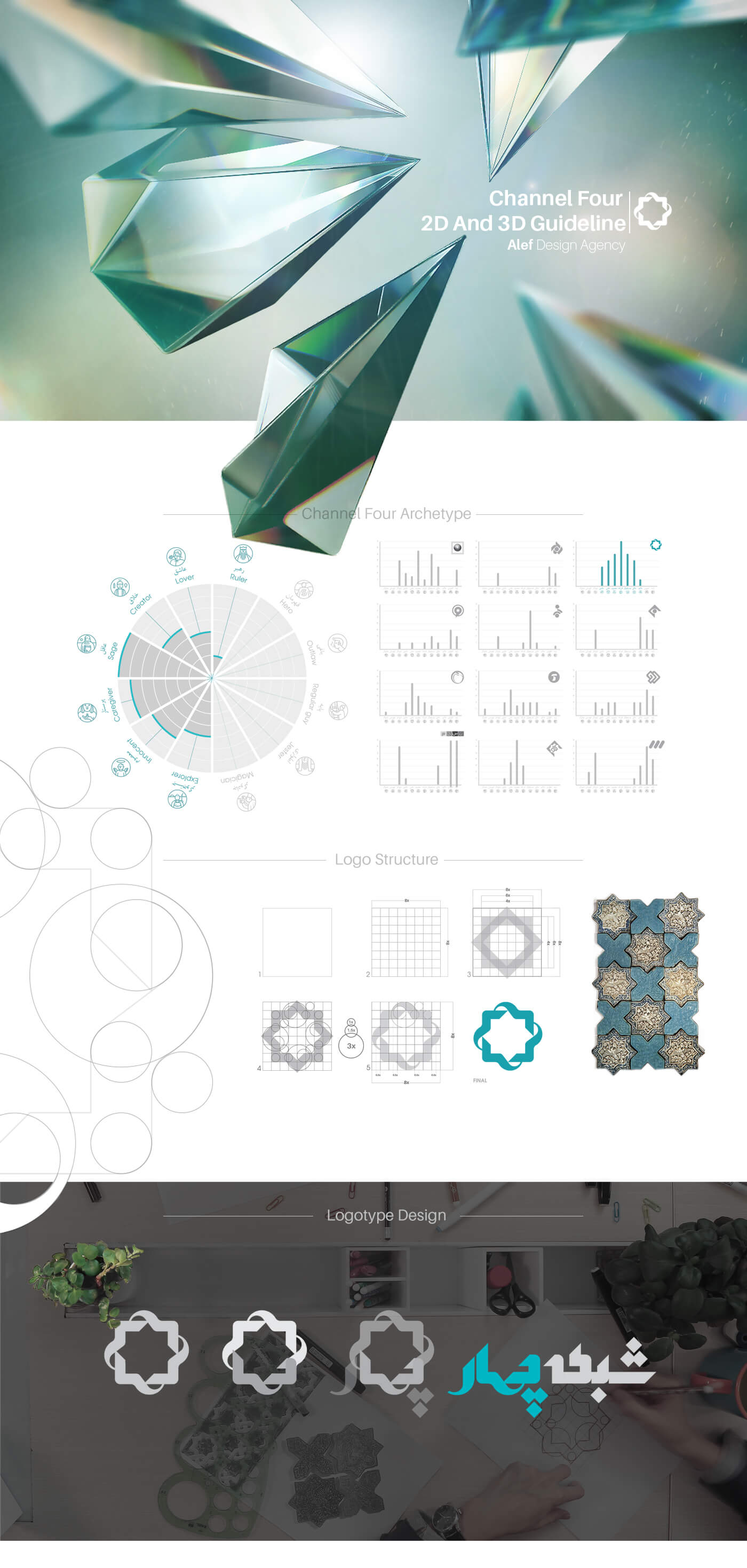
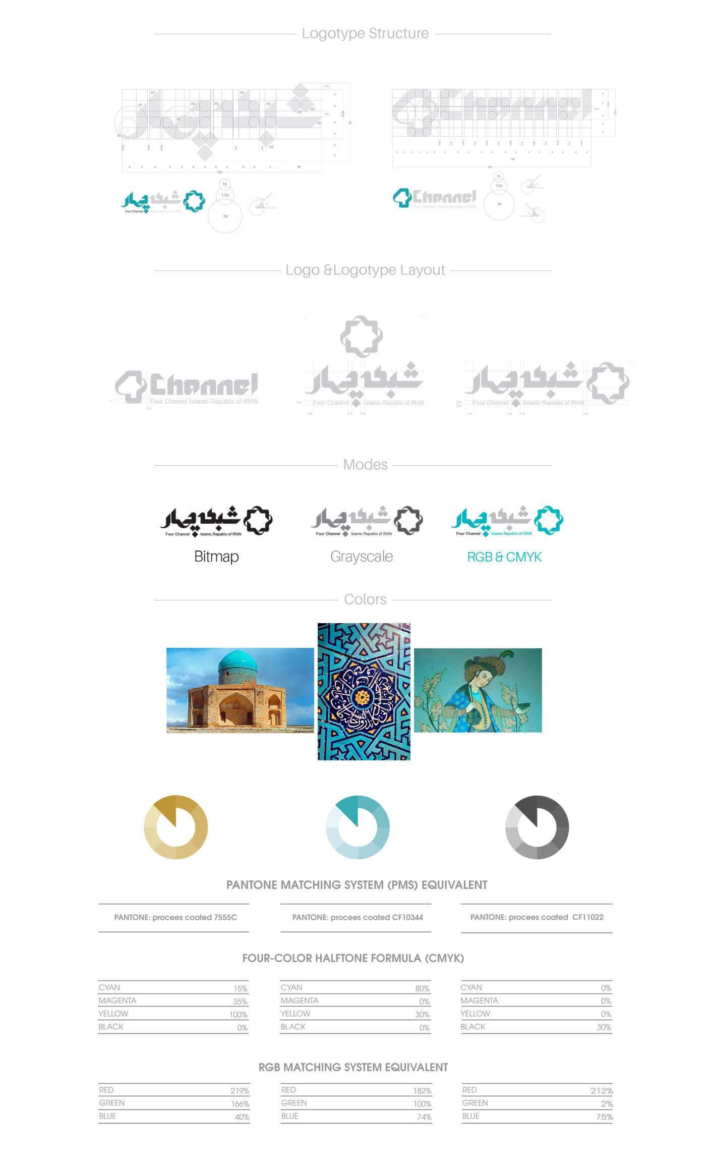
Designing the visual identity of Channel Four TV is a project that preserves the past structure of its identity. In ideation, to maintain the structure of the logo of this TV channel, the shape of eight-pointed sun (Iranian sun) has been used. The result of the redesign and use of this object is an Iranian atmosphere, and at the same time very modern and attractive in all the visual identity items of the project.
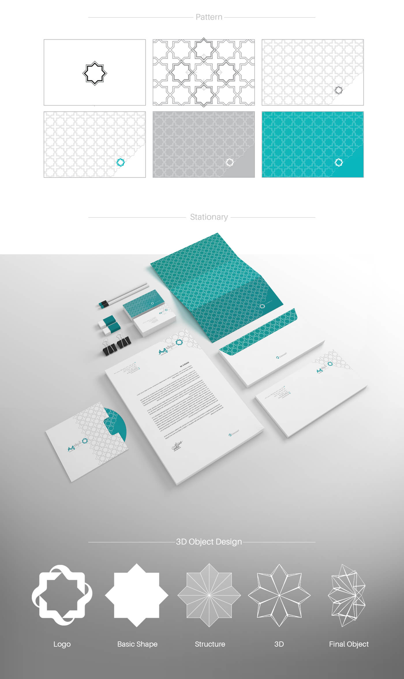
The Iranian sun is used separately in two-dimensional and three-dimensional space. The combination of eight-pointed sun with stalactite, which is one of the elements of Iranian architecture, forms the concept of the logo in two dimensions. Also, we designed the combination of rosette and stalactite in 3D, whose components are used in Logo Station.
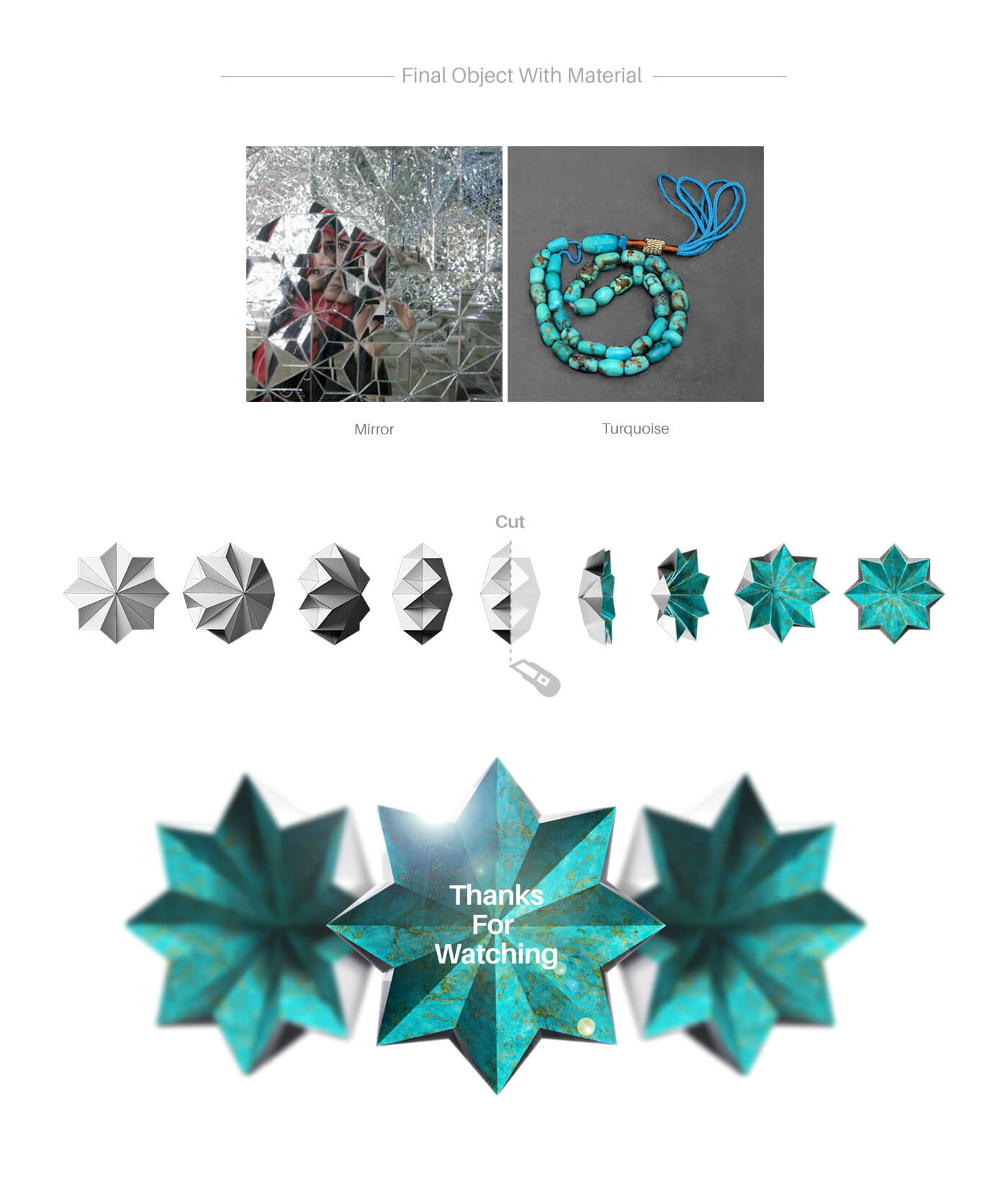
According to the goals and programs of Channel Four in the field of branding, referring to the authentic Iranian culture has been considered in all design sections. The chosen material in visual identity design and graphic design of Channel Four are mirror and turquoise. The mirror can have different materials, which are glass, crystal and brilliant in this project. The use of glass and mirrors has a special place in pure and noble Iranian art and architecture, and it has met our expectations beautifully in this project.
Besides being rooted in Iranian culture, the choice of turquoise material is in line with the identity of Channel Four TV. Turquoise is a precious stone with character among the people and artists of our country. In addition to its extraordinary beauty, this ornamental stone has centuries-old roots in the cultural, artistic and religious beliefs of us Iranians.
The visual identity of Channel Four TV has a wide range of items due to the extensive use of visual elements by the media. In addition to the scope, the high quality of the implementation of this project has made it one of our favorite works.
The Project ID:
The Project’s Year:
2016
Field of Activity:
Media, TV
The Client:
Channel Four TV
Project Type:
The Visual Identity Design (Branding)
Project items:
Logo & Logotype
- Logo Design
- FA Logotype Design
- ENG Logotype Design
Basic Elements
Layout
- Trademark Layout
- Logo Color Usage
- Horizontal FA Trademark Layout
- Vertical FA Trademark Layout
- Horizontal ENG Trademark Layout
- Vertical ENG Trademark Layout
- The Logo Partnership Usage
- Logo Master Alternate Usage
- Sub-Brand Logo Alternate Usage
- Logo Do & Do Not’s
Safety Area
- Logo Safety Area
- FA Trademark Safety Area
- ENG Trademark Safety Area
Colors
- Basic Colors CMYK/RGB/Pantone/Hex
- Secondary Colors CMYK/RGB/Pantone/Hex
- Neutral Colors CMYK/RGB/Pantone/Hex
- Gradient Colors CMYK/RGB/Pantone/Hex
- Color Do & Do Not’s
Color Modes
- CMYK/RGB
- Grayscale
- Bitmap
Surface and Frame
- Surface and Frame Design
Pattern
- Pattern Design
Stationary Systems
- Business Card
- A4 Letterhead
- A5 Letterhead
- Envelope
- A4 Envelope
- A5 Envelope
- Folder
- CD & CD Cover
- Notebook
- Note
Sample Applications
- Branded Car
- Shopping Bag
- Trophy Design
- Flag Design
- Badge
- Writing Tools
Font
- FA Font Design (Light- Regular- Bold- Black)
- ENG Font Design (Light- Regular- Bold- Black)
Online
Basic Elements In Online Media
- Logo & Logotype
- Colors
- Typeface
- Online Ad Grids
- Social Media Posts Grid
- Do & Do Not’s

