The Concept Behind Channel Four TV’s Font Design
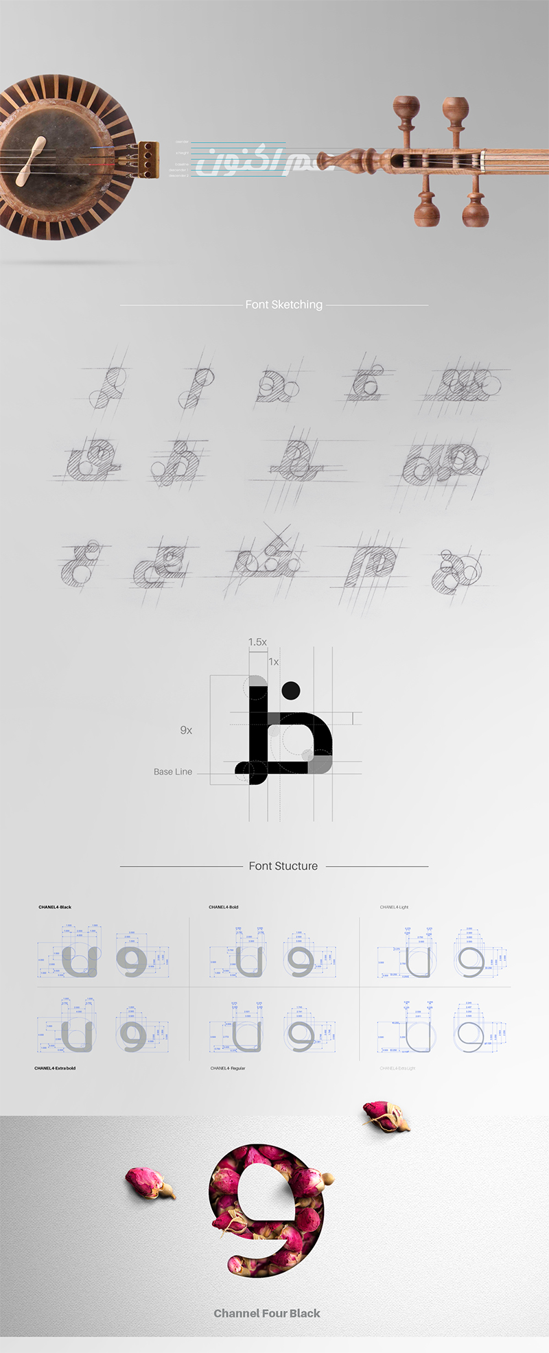
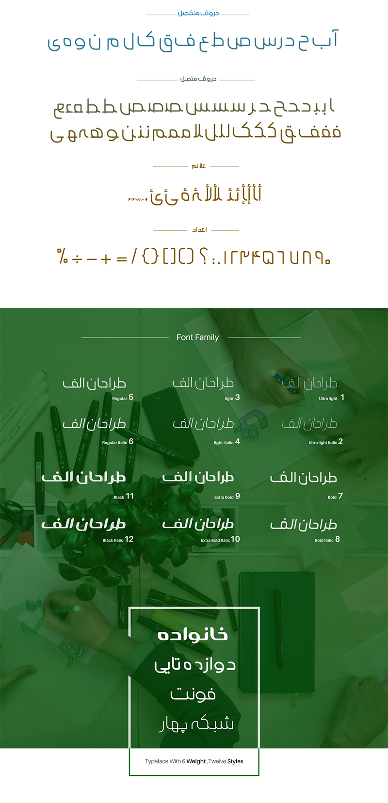
The font design of Channel Four TV has been implemented completely and comprehensively in the identity package of this network. This font uses a completely geometric and regular structure. All the letters are designed in different ways from the beginning and keeping certain principles. Due to the lack of Persian fonts with different thicknesses, separated letters, first connected letters, middle connected letters, last connected letters and all related numbers and symbols.
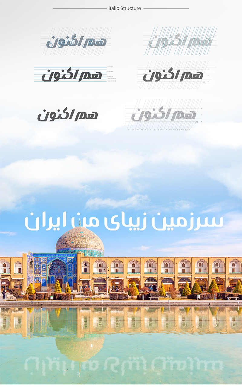
This font is designed in the form of a family of 14, which has 7 thicknesses and each thickness has an italic model. More interestingly, unlike most existing Persian and Arabic fonts, there is no change in the horizontal lines with a change in thickness. This point makes it not bigger or smaller by changing the thickness of the font.
