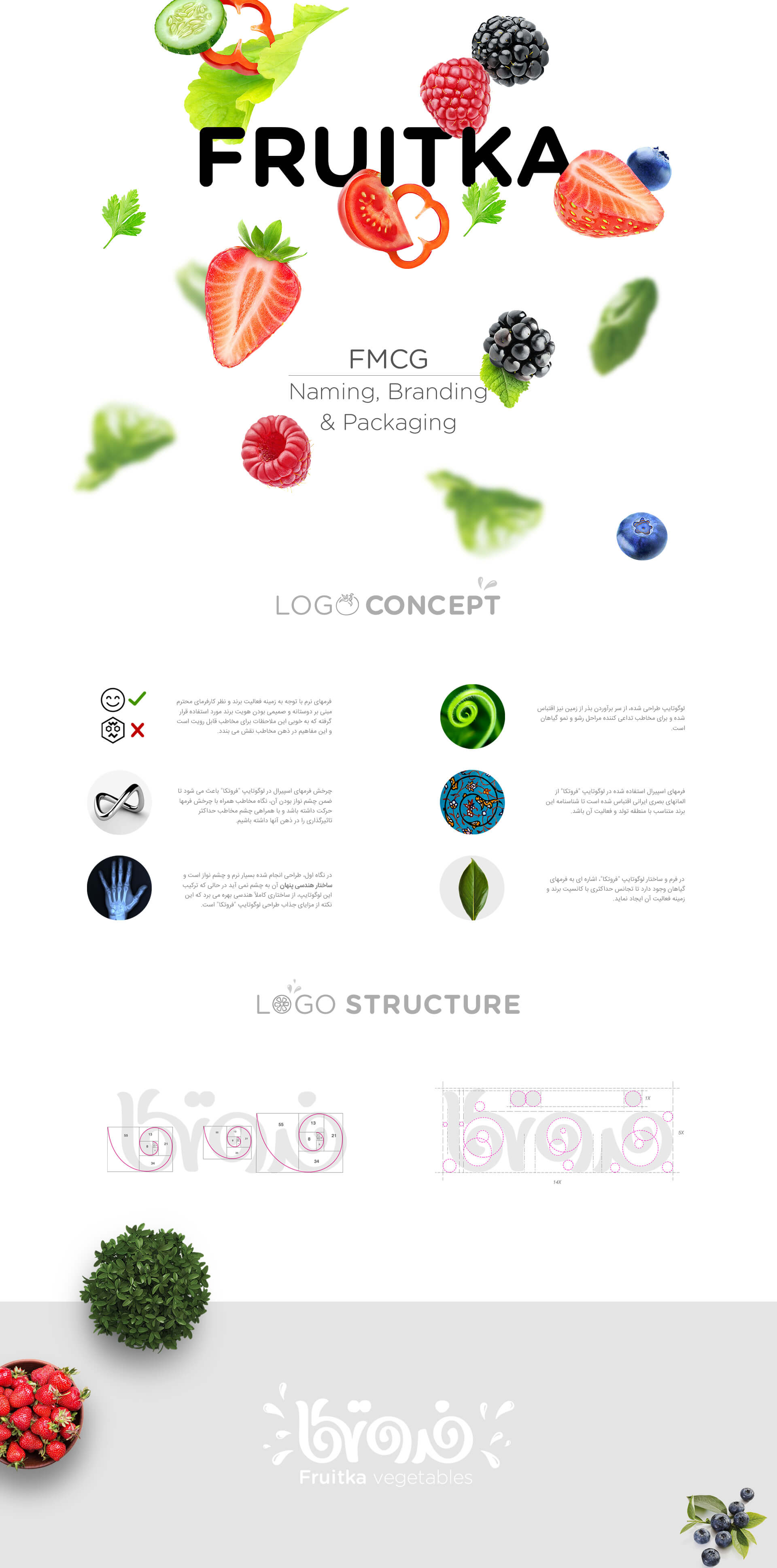
The Concept Behind Fruitka Brand’s Visual Identity
In 2017, Digikala Group decided to launch an FMCG store in its store platform. The selection of the name and slogan, the design of the visual identity of the Fruitka brand and the design of the packaging are among the items of the anticipated project that presented to us.
This project has been implemented in the form of an initial proposal for Digikala. At first, the name was chosen for this collection, and by adapting the word Fruit in English, the name Fruitka was chosen for this brand.
The design of the visual identity of the Fruitka brand has many outstanding and attractive points, which alone can be considered a valuable workshop for those interested in this field. The forms used in the logotype of this brand have special features that we mention:
- The forms used in this concept are very soft and friendly.
- Spiral forms make appealing to the audience.
- The geometric and strong structure of this concept is covered in soft and eye-catching performance layers.
- The spiral forms used have Iranian and traditional roots.
- The spiral structure is reminiscent of plant growth.
A very important point in the design of the visual identity of the Fruitka brand is the use of the Fibonacci combination. This golden and very valuable combination is used in all parts of the logotype.
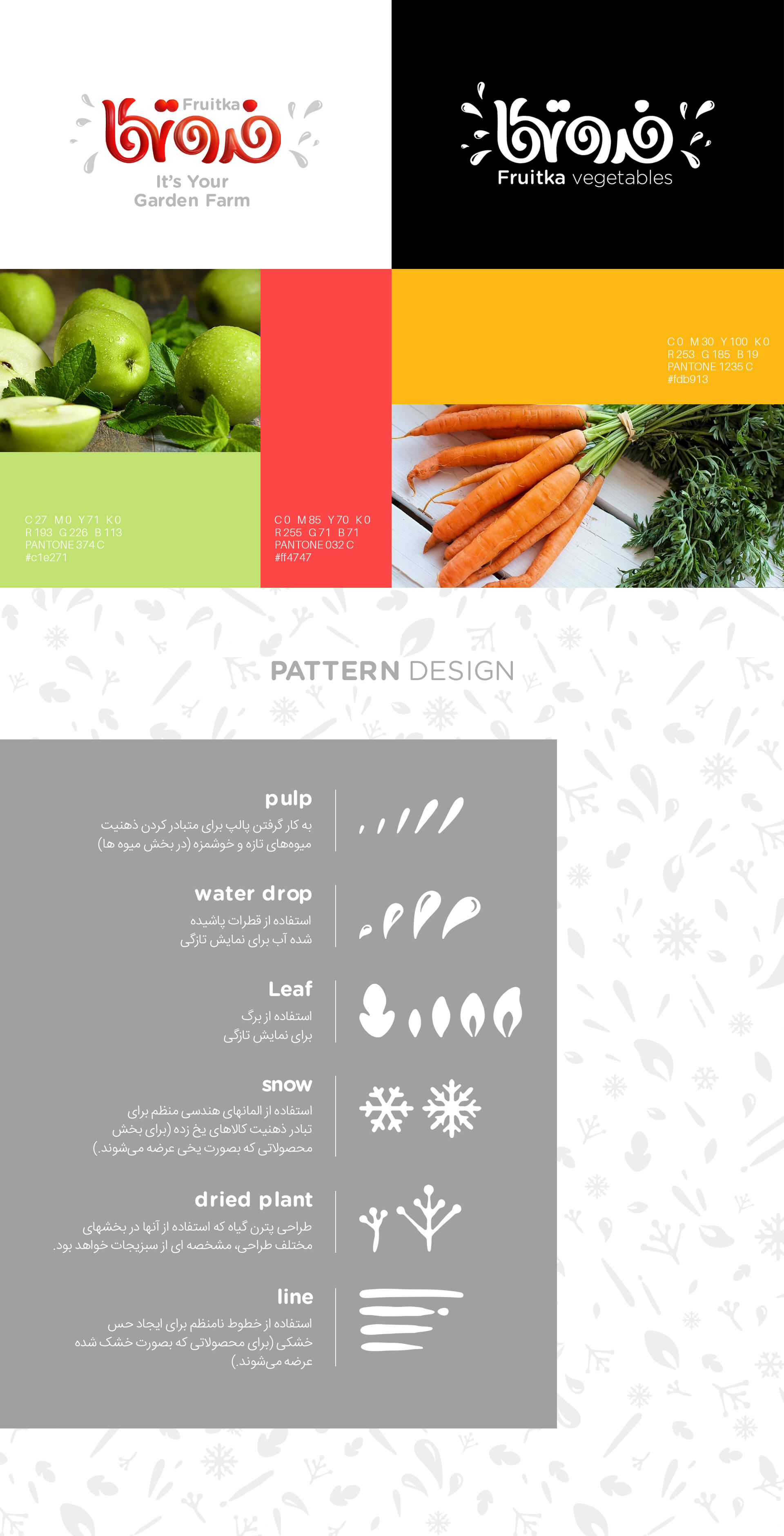
The pattern design of this brand is also implemented with a different approach. Adapted from all business related items from Fruitka for pattern design.
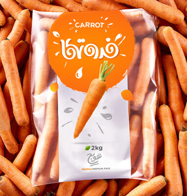
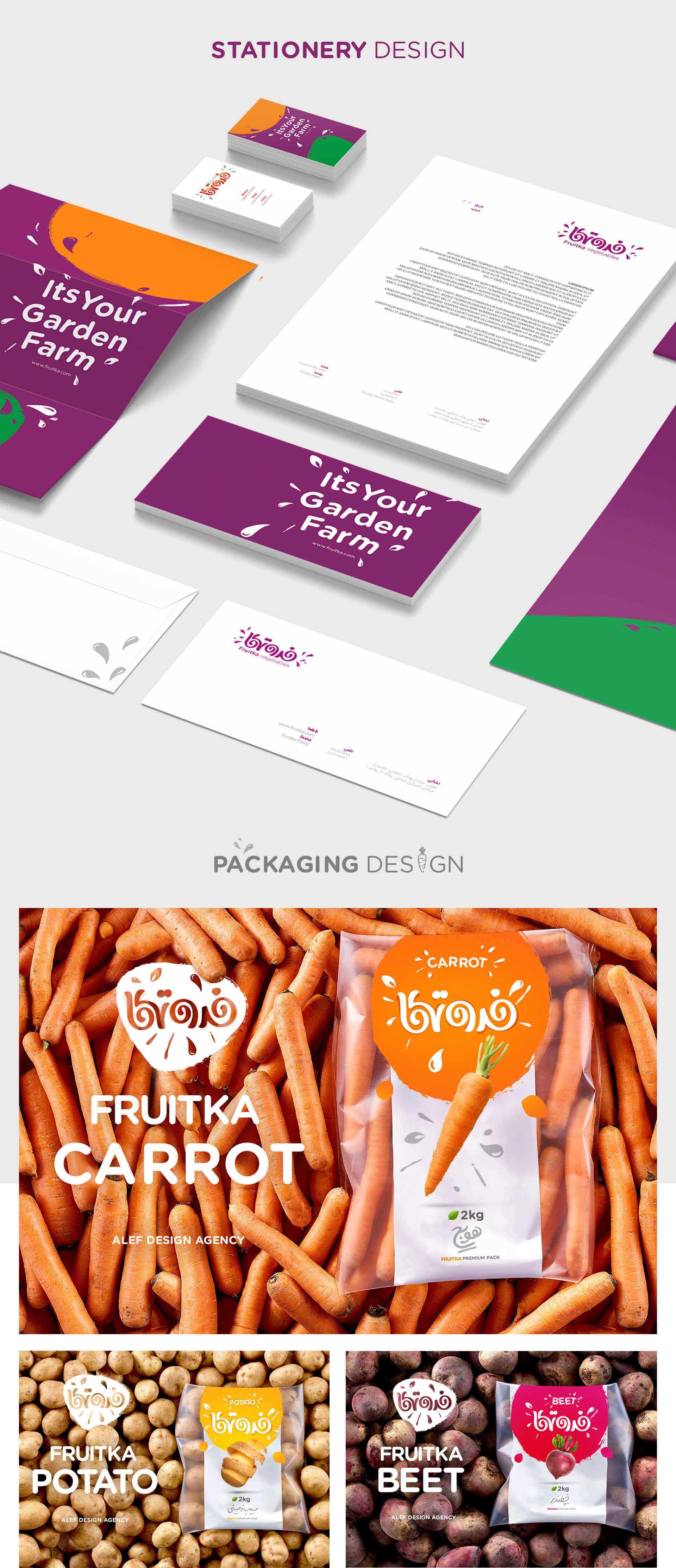
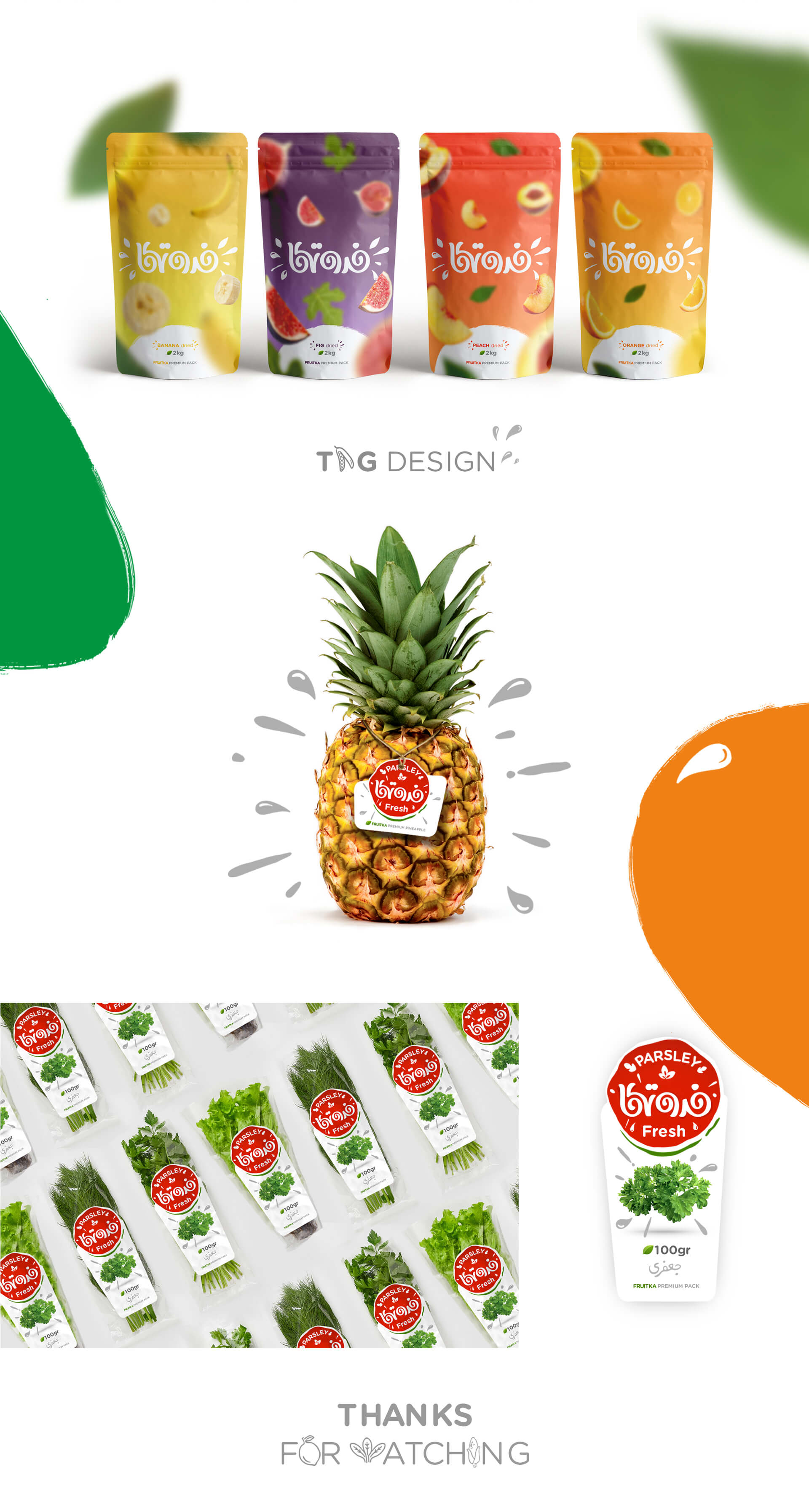
The project of the visual identity of the Fruitka brand includes various visual identity items, including packaging.
Project ID:
The Project’s Year:
2018
Field of Activity:
Consumer Goods (FMGC)
The Client:
Digikala
Project type:
Visual Identity Design (Branding)
Project items:
Logo & Logotype
- FA Logotype Design
Basic Elements
Layout
- Trademark Layout
- Logo Color Usage
- Horizontal FA Trademark Layout
- Vertical FA Trademark Layout
- Logo Master Alternate Usage (Print/Digital)
- Logo Do and Do Not’s
Safety Area
- Logo Safety Area
- FA Trademark Safety Area
Colors
- Basic Colors CMYK/RGB/Pantone/Hex
- Secondary Colors CMYK/RGB/Pantone/Hex
- Neutral Colors CMYK/RGB/Pantone/Hex
- Gradient Colors CMYK/RGB/Pantone/Hex
- Colors Do and Do Not’s
Color Modes
- CMYK/RGB
- Grayscale
- Bitmap
Typeface
- Master FA Typeface
- Master ENG Typeface
- Secondary FA Typeface
- Secondary ENG Typeface
- Headline and Subhead and Body Copy
- Typography Hierachy
- Typography Do and Do Not’s
Surface and Frame
- Surface and Frame Design
Icons
- Iconography Guidelines
- 20 icons designed
Pattern
- Pattern designed
Stationary Systems
- Business Card
- A4 Letterhead
- A5 Letterhead
- Envelope
- A4 Envelope
- A5 Envelope
Sample Applications
- Stamp
- Shopping Bag
- Fabric Shopping Bag
Online
Basic Elements In Online Media
- Logo and Logotype
- Typeface
- Online Ad Grids
- Social Media Posts Grid
- Do and Do Not’s